R可视化05|ggplot2图层-注释图层(Annotation layer)


本文介绍ggplt2如何给图形添加注释图层(Annotation layer)。
续前篇:
R可视化01|ggplot2-ggplot2简介
R可视化02|ggplot2-ggplot2快速绘图
R可视化03|ggplot2图层-几何对象图层(geom layer)
R可视化04|ggplot2图层-统计变换图层(stat layer)
目录
1、添加文本(Text labels)
2、 添加注释(Building custom annotations)
3、分面图中添加注释(Annotation across facets)
1、添加文本(Text labels)
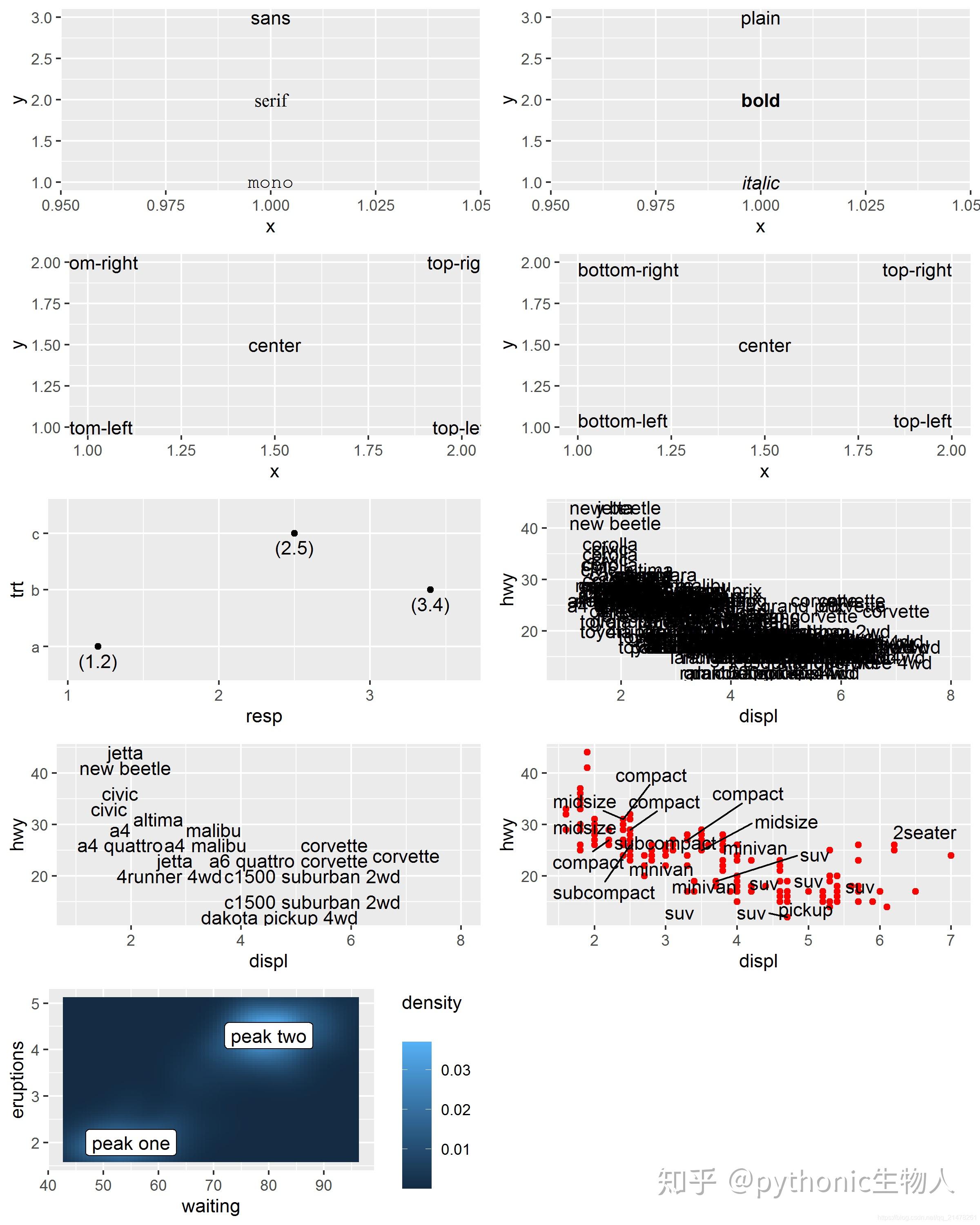
geom_text()添加文本及其在图中的横纵坐标,可修改文本字体(family)、磅值(fontface)、水平位置hjust (“left”, “center”, “right”, “inward”, “outward”)、垂直位置vjust (“bottom”, “middle”, “top”, “inward”, “outward”)、大小(size)、倾斜度(angle)、文字距原坐标点的距离(nudge)、防文本重叠(check_overlap);防文本重叠(ggrepel::geom_text_repel)
options(repr.plot.width = 8, repr.plot.height = 10, repr.plot.res = 300)
df <- data.frame(x = 1, y = 3:1, family = c("sans", "serif", "mono"))
#文本字体family aesthetic
p1 <- ggplot(df, aes(x, y)) +
  geom_text(aes(label = family, family = family))

#文本磅值(fontface)
df <- data.frame(x = 1, y = 3:1, face = c("plain", "bold", "italic"))
p2 <- ggplot(df, aes(x, y)) +
  geom_text(aes(label = face, fontface = face))

#文本水平位置hjust (“left”, “center”, “right”, “inward”, “outward”)、
#垂直位置vjust (“bottom”, “middle”, “top”, “inward”, “outward”)
df <- data.frame(
  x = c(1, 1, 2, 2, 1.5),
  y = c(1, 2, 1, 2, 1.5),
  text = c(
    "bottom-left", "bottom-right",
    "top-left", "top-right", "center"
  )
)
p3 <- ggplot(df, aes(x, y)) +
  geom_text(aes(label = text))

p4 <- ggplot(df, aes(x, y)) +
  geom_text(aes(label = text), vjust = "inward", hjust = "inward")#设置水平垂直位置


#文字距原坐标点的距离(nudge)
df <- data.frame(trt = c("a", "b", "c"), resp = c(1.2, 3.4, 2.5))
p5 <- ggplot(df, aes(resp, trt)) +
  geom_point() +
  geom_text(aes(label = paste0("(", resp, ")")), nudge_y = -0.25) +
  xlim(1, 3.6)


#防文本重叠(check_overlap)
p6 <- ggplot(mpg, aes(displ, hwy)) +
  geom_text(aes(label = model)) +
  xlim(1, 8)
p7 <- ggplot(mpg, aes(displ, hwy)) +
  geom_text(aes(label = model), check_overlap = TRUE) +
  xlim(1, 8)


#防文本重叠(ggrepel::geom_text_repel)
library('ggrepel')
mini_mpg <- mpg[sample(nrow(mpg), 20),]
p8 <- ggplot(mpg, aes(displ, hwy)) + geom_point(colour = "red") +
ggrepel::geom_text_repel(data = mini_mpg, aes(label = class))

#添加文本背景框
label <- data.frame(
  waiting = c(55, 80),
  eruptions = c(2, 4.3),
  label = c("peak one", "peak two")
)

p9 <- ggplot(faithfuld, aes(waiting, eruptions)) +
  geom_tile(aes(fill = density)) +
  geom_label(data = label, aes(label = label))

p10 <- grid.arrange(p1,p2,p3,p4,p5,p6,p7,p8,p9,nrow = 5)


ggsave("plot1.png", p10, width = 8, height = 5)
2、 添加注释(Building custom annotations)
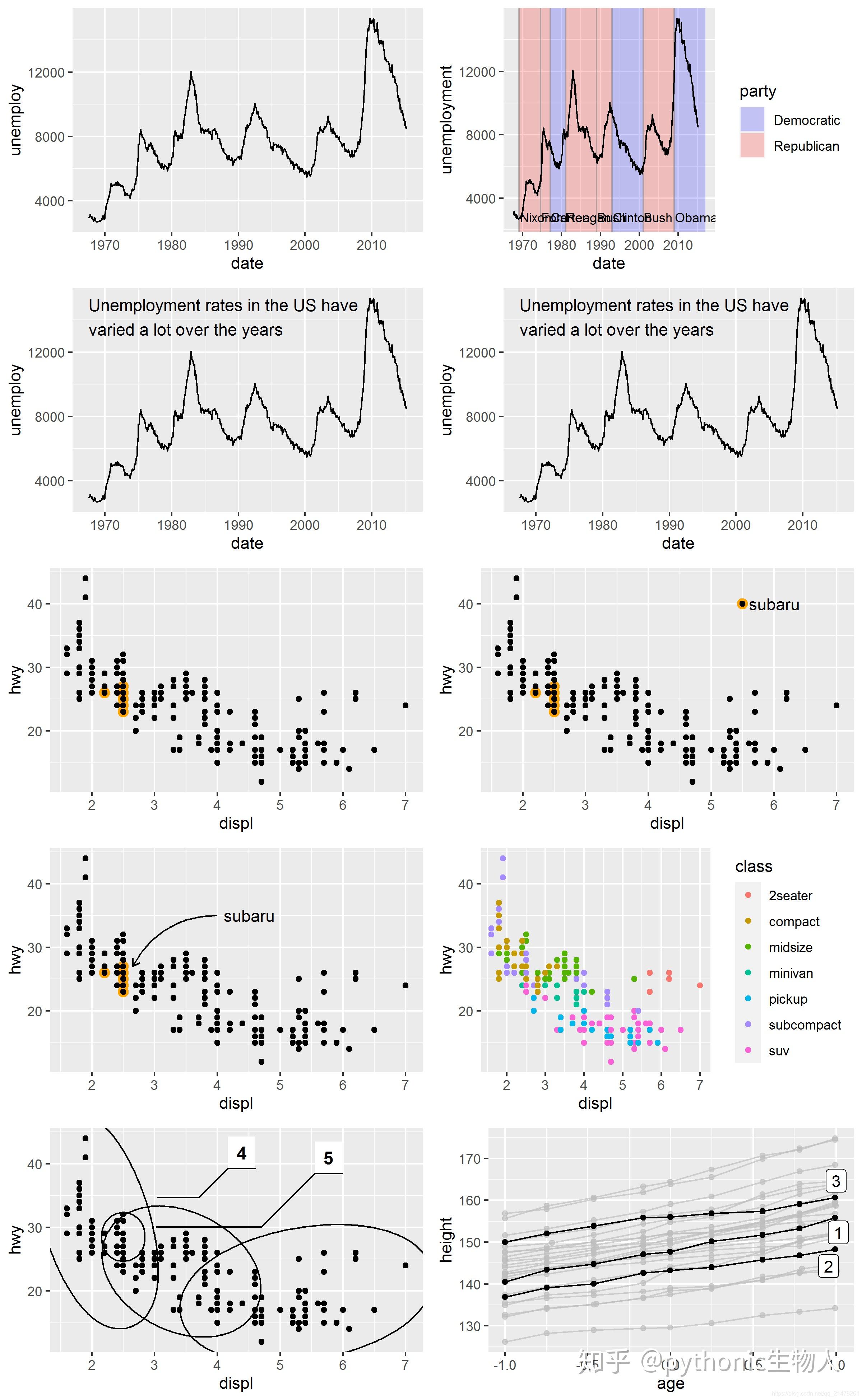
ggplot2 package provides several other tools to annotate plots using the same geoms you would use to display data.
geom_text()、geom_label()添加文本 text, 见part1。geom_rect():用一个矩形圈出感兴趣的区域,指定xmin,xmax,ymin,ymax。geom_line()、geom_path()、``geom_segment():在图形中添加线条、arrow()可以用来添加箭头,可指定a``ngle,length,endsandtype。geom_vline()、geom_hline()、geom_abline():添加垂直线、水平线、添加任意斜率和截距地直线。- directlabels::geom_dl:directlabels直接加标签。
- ggforce::geom_mark_ellipse:ggforce突出某部分。
- gghighlight::gghighlight:gghighlight突出某部分。
- annotate:annotate添加文本。
以实例介绍各函数的使用
options(repr.plot.width = 8, repr.plot.height = 13, repr.plot.res = 300)
#添加折线geom_line()
p1 <- ggplot(economics, aes(date, unemploy)) +
  geom_line()


#添加矩形区域线geom_rect(),指定xmin,xmax,ymin,ymax
presidential <- subset(presidential, start > economics$date[1])

p2 <- ggplot(economics) +
  geom_rect(
    aes(xmin = start, xmax = end, fill = party),
    ymin = -Inf, ymax = Inf, alpha = 0.2,
    data = presidential
  ) +
  geom_vline(#添加垂直线geom_vline()
    aes(xintercept = as.numeric(start)),
    data = presidential,
    colour = "grey50", alpha = 0.5
  ) +
  geom_text(#添加文本geom_text()
    aes(x = start, y = 2500, label = name),
    data = presidential,
    size = 3, vjust = 0, hjust = 0, nudge_x = 50
  ) +
  geom_line(aes(date, unemploy)) +
  scale_fill_manual(values = c("blue", "red")) +
  xlab("date") +
  ylab("unemployment")


#geom_text左上侧添加文本方法一【略显复杂】
yrng <- range(economics$unemploy)
xrng <- range(economics$date)
caption <- paste(strwrap("Unemployment rates in the US have
  varied a lot over the years", 40), collapse = "\n")

p3 <- ggplot(economics, aes(date, unemploy)) +
  geom_line() +
  geom_text(
    aes(x, y, label = caption),
    data = data.frame(x = xrng[1], y = yrng[2], caption = caption),
    hjust = 0, vjust = 1, size = 4
  )


#annotate左上侧添加文本方法二【推荐】
p4 <- ggplot(economics, aes(date, unemploy)) +
  geom_line() +
  annotate(
    geom = "text", x = xrng[1], y = yrng[2],
    label = caption, hjust = 0, vjust = 1, size = 4
  )


##给某一类点上色
library('dplyr')
p5 <- ggplot(mpg, aes(displ, hwy)) +
  geom_point(data = filter(mpg, manufacturer == "subaru"),
    colour = "orange",
    size = 3
  ) +
  geom_point()

#右上角添加图例
p6 <- p5 +
  annotate(geom = "point", x = 5.5, y = 40, colour = "orange", size = 3) +
  annotate(geom = "point", x = 5.5, y = 40) +
  annotate(geom = "text", x = 5.6, y = 40, label = "subaru", hjust = "left")


p7 <- p5 +
  annotate(#添加箭头
    geom = "curve", x = 4, y = 35, xend = 2.65, yend = 27,
    curvature = .3, arrow = arrow(length = unit(2, "mm"))
  ) +
  annotate(geom = "text", x = 4.1, y = 35, label = "subaru", hjust = "left")#添加文本


#按class添加颜色
p8 <- ggplot(mpg, aes(displ, hwy, colour = class)) +
  geom_point()


#directlabels::geom_dl直接加标签
library("directlabels")
p9 <- ggplot(mpg, aes(displ, hwy, colour = class)) +
  geom_point(show.legend = FALSE) +
  directlabels::geom_dl(aes(label = class), method = "smart.grid")


#ggforce扩展包突出某部分
library('ggforce')
p9 <- ggplot(mpg, aes(displ, hwy)) +
  geom_point() +
  ggforce::geom_mark_ellipse(aes(label = cyl, group = cyl))


#gghighlight扩展包突出某部分
library('gghighlight')
data(Oxboys, package = "nlme")
p10 <- ggplot(Oxboys, aes(age, height, group = Subject)) +
  geom_line() +
  geom_point() +
  gghighlight::gghighlight(Subject %in% 1:3)


grid.arrange(p1,p2,p3,p4,p5,p6,p7,p8,p9,p10,nrow = 5)
3、分面图中添加注释(Annotation across facets)
直接看代码。
options(repr.plot.width = 5, repr.plot.height = 7, repr.plot.res = 300)
p1 <- ggplot(diamonds, aes(log10(carat), log10(price))) +
  geom_bin2d() +
  facet_wrap(vars(cut), nrow = 1)

#分面图添加参考线
mod_coef <- coef(lm(log10(price) ~ log10(carat), data = diamonds))
p2 <- ggplot(diamonds, aes(log10(carat), log10(price))) +
  geom_bin2d() +
  geom_abline(intercept = mod_coef[1], slope = mod_coef[2],
    colour = "white", size = 1) +
  facet_wrap(vars(cut), nrow = 1)


#gghighlight::gghighlight高亮某类
p3 <- ggplot(mpg, aes(displ, hwy, colour = factor(cyl))) +
  geom_point() +
  gghighlight::gghighlight() +
  facet_wrap(vars(cyl))

grid.arrange(p1,p2,p3,nrow = 3)

参考资料https://ggplot2-book.org/annotations.html
本文结束,更多好文,欢迎关注公众号:pythonic生物人
Python可视化|Matplotlib39-Matplotlib 1.4W+字教程(珍藏版)
Python可视化|Matplotlib&Seaborn36(完结篇)
python3基础12详解模块和包(库)|构建|使用
Perl基础系列合集
NGS各种组学建库原理(图解)
发布于 2020-10-06 07:49