好用的R小技巧


我觉得 R 是一种很神奇的语言,用好了的话事半功倍,但其间要会有很多很多坑,希望大家多多注意不要泥足深陷。
- 时刻注意数据类型,很多报错是因为类型不符而产生的 chr or int ?factor 也是一个很难缠的数据类型(但省位子)
- 经常plot一下你的处理后数据,查看是否有异常。 很简单的一步,chr 变 numeric,需要as.numeric(as.character(x)) ,这样数据才不会出错。
==================读入文件================
dat <- as.data.frame(read.table("input.csv",header = TRUE,sep = ",", dec = ".",na.strings = "NA",stringsAsFactors=FALSE,check.names = FALSE))
row.names(dat) <- dat[,1]
dat<-dat[,-1]
dat[1:5,]

na.strings = "NA"控制缺失值
stringsAsFactors=FALSE,让每列的数据该是什么类型就是什么类型,全列数字的才自动成int 或dbl ,
check.names = FALSE,有行名如果是纯数字开头,会自动变成X开头,这个对后面的匹配很不友好,所以可以加这一句,避免变X。
==================写出文件================
#csv & txt
y_name=gsub("/", "&", y_name)
write.csv(d,file = paste('dat/',y_name,'.csv',sep=""),quote=F,row.names=F)

#png
png(file="metabolites_distribution_among_cancertype.png",width=2000,height=1000)
#content...
dev.off()

#pdf
pdf(file="metabolites_distribution_among_cancertype.pdf")
#content...
dev.off()
============ 删除带有的NA行并匹配两表格 ============
#以下两种方法需要table1 和 table2 的行名是按顺序一一对应的,
#先获取table1中NA的行号
dim(table1)
non_NA <- !is.na(table1[,1])
table1<-table1[non_NA,]     #(去NA行方法1)
summary(non_NA)

#如果有另一个table2 与 table1 对应,需要同样去除NA的行
table2<-as.data.frame(table2[non_NA,])
dim(table2)

#同理,也可以先获取NA的行号,使用时直接调用
non_NA <- !is.na(table2[,1])
function(data.x=table1[non_NA,], data.y=table2[non_NA,]...)
#如果table1 和table2 的行名顺序是不一样的,需要用merge
#先获取去除table1d NA行(更新table1)
table1<-table1[complete.cases(table1),]  #(去NA行方法2)
#table1<-na.omit(table1) #(去NA行方法3)
dat_rmNA<-merge(table1,table2,by="row.names",all.x=TRUE)
================删除全部为NA的行/列===============
# remove all NA row/column
drop_Nas <- function (data,dim){
     if (dim == 2){
         na_flag <- apply(!is.na(data),2,sum) # use ! to inverse 1 (to 0 0) and 0 (to 1).
         data <- data[,-which(na_flag == 0)]
     }
     else if (dim == 1){
         na_flag <- apply(!is.na(data),1,sum)
         data <- data[-which(na_flag == 0),]
     }
     else{
         warning("dim can only equal to 1 and 2, 1 means row, 2 means column ")
     }
     return(data)
 }

dim(tumor)
drop_Nas(dat,1)  #1 means row, 2 means column


================impute with 最小值================
#check missing value and impute with min value
sum(is.na(data))

library(Hmisc)
impute_min=function(x) impute(x,min)
new=as.data.frame(apply(data,1,impute_min))   #1是行最小值,2是列最小值,记得要是numeric
head(data) #before impute
head(new)  #after impute
data=new
sum(is.na(data))
data[1:3,]


==================data.frame 格式改变 ===============
#一整个data.frame(需确认全是数字)的转换
dat_n=as.data.frame(lapply(dat[,-1],as.numeric))

#字符串型label转变为numeric类型
table(dat[,1])
a <- sub("F",2,data_pca[,1])
b <- sub("M",1,a)
dat[,1] <- a
dat[,1] <- b
dat<-as.data.frame(data_pca)

#一整个data.frame的factor变为numeric  #is.factor也可以换成 is.character
dat_n[] <- lapply(dat, function(x) {
    if(is.factor(x)) as.numeric(as.character(x)) else x
}) 

==================统计每行/列有多少个0================
dat=as.data.frame(dat)
#dat[1:5,]
f<-function(x) sum(x==0)
#按列统计是2,按行统计是1
d<-as.data.frame(apply(dat,2,f))
d

#如果数据中心还有NA,则整一个会显示为NA

#画图直接显示多少个NA
barplot(colSums(is.na(data)),
        ylab = "# missing values",
        xlab = "Sample")
==================统计缺失值================
#统计总缺失值个数
sum(is.na(data))

#按列统计缺失值
sapply(data, function(x) sum(is.na(x)))

#统计缺失率,按列为2,按行为1
miss <- function(x){sum(is.na(x))/length(x)}
apply(data,2,miss)
============ jupyter notebook 中 python 结果显示多行==========
from IPython.core.interactiveshell import InteractiveShell
InteractiveShell.ast_node_interactivity = "all"
================初始化list或者array===========
#array
#dim=c(2,3,4),创建4个矩形矩阵,每个矩阵2行3列。
result <- array(NA,dim=c(dim(X)[2], 4, dim(Y)[2]))
rownames(result) <- colnames(X)
colnames(result) <- c("p","q","z","est")

#list
p_result <-rep(NA,length=dim(X)[2])
p_result[i] <- ...

#生成重复序列
rep(c("1","2","3"),times=c(5,42,34))
================移除/提取特定行和列============
#移除行列
dat<-dat[!rownames(dat) %in% c("12691.PC30","12691.PC10"),]
dat<-dat[,!colnames(dat) %in% c("specimen_id")]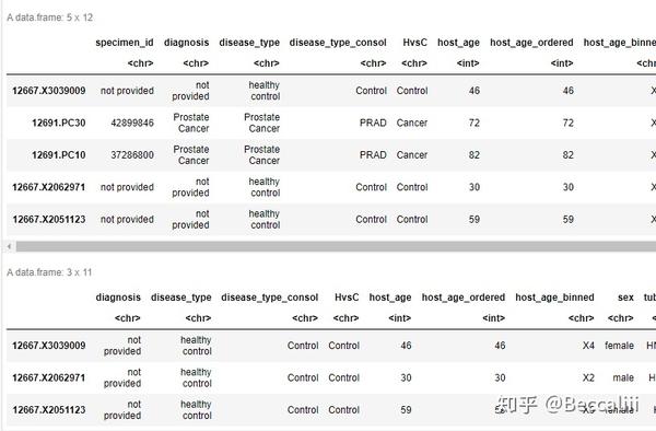

#提取特定行列 需要注意,这个方法如果没有这个列名/行名的话,会产生NA,首选推荐使用subset
dat<-dat[,c("specimen_id","disease_type_consol")]
dat<-dat[c("12691.PC30","12691.PC10"),]

#多个条件提取行/指定信息
subset(dat,host_age<=50&HvsC=="Cancer")
subset(dat,host_age<=50&HvsC=="Cancer",select=specimen_id)
#这个方法有个bug,NA的数据也会一并读入,且整一行都会变成NA,所以用完这个之后,还要去除NA行

在eset_f中,只提取dif表中有的行,并存储成selected 表
dif <- dif[dif[, "P.Value"]<0.01,]
dim(dif)
#head(dif)

library(pheatmap)
selected <- eset_f[rownames(dif), ]
================列表删除特定元素============
list<-list[list != "SMP0000715"]=============两个直方图结合在一起============
#par(mfrow=c(2,2))
p1=hist(Ct,breaks = 100)
p2=hist(Cn,breaks = 100)

plot(p1,col=rgb(0,0,1,1/4))    #xlim=c(-1,1)
plot(p2,col=rgb(1,1,0,1/4), add=T)  # second
abline(v=0,col="red")

==============数据标准化+年龄&性别==========
一般数据要做标准化noramlization,保证不同批次、不同样本间有可比较性,一般再用PCA检查一下还有没有批次效应batch effect 。voom的操作中有log处理,相当于scaling,数据范围缩小。
四分位标准化quantile normalizations
四分位标准化原理:样本内部按特征的大小排序(上),然后横向取同一rank的所有数据,求平均值并用平均值取代该rank的所有数据(下)。qnorm能有效降低离群异常值的影响。


#read in data
qcMetadata <- as.data.frame(read.csv("sampleData.csv", header = TRUE, sep = ",", dec = ".",stringsAsFactors=FALSE))
row.names(qcMetadata) <- qcMetadata[,1]
qcMetadata<-qcMetadata[,-1]
#samples in row and features in colname
qcMetadata[1:5,]

qcData <- as.data.frame(read.csv("Raw-Data.csv", header = TRUE, sep = ",", dec = ".",stringsAsFactors=FALSE))
row.names(qcData) <- qcData[,1]
qcData<-qcData[,-1]
qcData[1:5,]

## Load packages ##
  library(limma)
  library(edgeR)
  library(dplyr)
  library(snm)
  library(doMC)
  library(tibble)
  library(gbm)

  numCores <- detectCores()
  registerDoMC(cores=numCores)

  # Set up design matrix
  covDesignNorm <- model.matrix(~0 + disease_type_consol +
                                    host_age + # host_age should be numeric
                                    sex, # sex should be a factor
                                  data = qcMetadata)

  # Check row dimensions
  dim(covDesignNorm)[1] == dim(qcData)[1]

  #print(colnames(covDesignNorm))
  # The following corrects for column names that are incompatible with downstream processing
  colnames(covDesignNorm) <- gsub('([[:punct:]])|\\s+','',colnames(covDesignNorm))
  #print(colnames(covDesignNorm))

  # Set up counts matrix
  counts <- t(qcData) # DGEList object from a table of counts (rows=features, columns=samples)

  # Quantile normalize and plug into voom
  dge <- DGEList(counts = counts)
  vdge <- voom(dge, design = covDesignNorm, plot = TRUE, save.plot = TRUE,
                                              normalize.method="quantile")

  # List biological and normalization variables in model matrices
  bio.var <- model.matrix(~disease_type_consol,
                          data=qcMetadata)

  adj.var <- model.matrix(~host_age + sex,
                          data=qcMetadata)

  colnames(bio.var) <- gsub('([[:punct:]])|\\s+','',colnames(bio.var))
  colnames(adj.var) <- gsub('([[:punct:]])|\\s+','',colnames(adj.var))
  #print(dim(adj.var))
  #print(dim(bio.var))
  #print(dim(t(vdge$E)))
  #print(dim(covDesignNorm))

  snmDataObjOnly <- snm(raw.dat = vdge$E,
                        bio.var = bio.var,
                        adj.var = adj.var,
                        rm.adj=TRUE,
                        verbose = TRUE,
                        diagnose = TRUE)
  snmData <- as.data.frame(t(snmDataObjOnly$norm.dat))
  snmData[1:5,]


boxplot初步看数据有没有标准化
exp=t(qcData) #原始数据
#for exp data format: samples in colname and features in row
exp[1:2,]
qnexp=t(snmData) #标准化后数据
qnexp[1:2,]

par(mfcol=c(3,1))
boxplot(exp[,sample(1:ncol(exp), 30)], main="raw read count distribution by sample")
boxplot(log2(1+exp[,sample(1:ncol(exp), 30)]), main="loged(scale) read count distribution by sample")
boxplot(qnexp[,sample(1:ncol(qnexp), 30)], main="quantile norm read count distribution by sample")
第二个boxplot, log时+1是为了避免原始数据有大量0,随机从数据集中选30个样本来比较。


============boxpot/散点图分颜色 =============
#normal distribution vs tumor distribution
library(dplyr)
library(ggplot2)
library(ggpubr)
#tmp %>% ggplot(aes(MNAgroup,methy_rate,fill=MNAgroup))+geom_boxplot()+geom_jitter(alpha=0.5)

compare_means(methy_rate ~ MNAgroup, data = tmp)
p <- ggboxplot(tmp, x = "MNAgroup", y = "methy_rate", palette = "jco",color="MNAgroup",add = "jitter")
#  Add p-value
p + stat_compare_means()
# Change method
#p + stat_compare_means(method = "t.test")
============Bootstrap自助法==========


library(broom)
library(glmnet)

indices=1
    y<-as.numeric(as.character(metabolites[,indices]))
    x1<-as.numeric(as.character(metagenomics[,indices]))
    x2<-as.numeric(as.character(data[,1]))
    x3<-as.numeric(as.character(data[,2]))
rsq <- function(formula,data, indices) {
    fit <- lm(formula, data=as.data.frame(data))
    pvalue<-tidy(summary(fit))$p.value[2]
    ar2<-summary(fit)$adj.r.square
    re=c(ar2,pvalue)
    return(re)
}

library(boot)
set.seed(1234)
results <- boot(data=data, statistic=rsq,
                R=1000, formula=y~ x1+x2+x3)
print(results)
#plot(results)
#boot.ci(results, type=c("perc", "bca"))

Broom 用来提取模型结果,其他相关资料:
==================缺失值处理/impute================
#方法一 最小值填充
library(Hmisc)
impute_min=function(x) impute(x,min)
new=as.data.frame(apply(data,2,impute_min)) #2是按列填充,1是按行填充,data是输入数据

#多重填补 MICE包
library(mice)
library(mice)
imputed=mice(data,m=5,meth="pmm",seed=1007)
head(complete(imputed))
============correlation analysis==============
#带NA的做不了correlation analysis,所以要先impute。
# 千万注意是要看样本还是特征的相关度,在这里是指同一个data frame的的非重复两两比较

head(dat_tmp)
#COORELATION
cor <- 0
d<-c("0","0","0")
end=ncol(dat_tmp)-1
for (i in 1:end) {
    x = dat_tmp[,i]
    s=i+1
    for (j in s:ncol(dat_tmp)) {     #这里以列列比较为例
        cor_n <- cor(x, y = dat_tmp[,j], method = "spearman")  #spearman or pearson
        cor<-append(cor,cor_n)
        if(as.numeric(as.character(cor_n))>0.9 ){   #按需设定correlation, 输出在d,输出内容越多,运行越慢,如果想全输出,可以略去if这一步
            n1<-colnames(dat_tmp)[i]
            n2<-colnames(dat_tmp)[j]
            re<-c(n1,n2,cor_n)
            d<-rbind(d,re)
        }
    }
}

summary(cor[-1])
hist(cor[-1],breaks=100,xlim=c(-1,1))  #correlation distribution,看相关度大概率落在哪个范围

d<-d[order(d[-1,3],decreasing=TRUE),]
head(d)


============Permutation Test置换检验==========
Permutation Test:
data<-as.data.frame(read.table("data/metabolomics_metagenomics_34JC.csv",sep=",",header=T,row.names=1,stringsAsFactors=F))
data<-t(data[-c(1,2),])
metagenomics<-data[,1:169]
metabolites<-data[,170:295]

#shuffles label in one group
j = sample(1:nrow(metabolites),1*nrow(metabolites))
#metabolites = metabolites[j,]
#metagenomics = metagenomics[j,]

#metagenomics[1:2,]
#metabolites[1:2,]

cor <- numeric(dim(metagenomics)[2])
for (i in 1:dim(metagenomics)[2]) {
cor[i] <- cor(x = metabolites[,1], y = metagenomics[,i], use = "everything", method = "spearman")
}
#med
hist(cor,breaks=100)
#inter <- quantile(med, c(0.025,0.975))
#inter
应用说明见下文最后:
==================数组排序================
d<-d[order(d[,2],decreasing=TRUE),]================根据两列数据统计数据且画直方图=========
#calculate sample type frequence in each cancer type
library(dplyr)
summaryData<-as.data.frame(group_by(dat,ONCOTREE_CODE,SAMPLE_TYPE) %>% summarise(.,count=n()))
summaryData


#bar plot
par(mfrow=c(1,2))
ggplot(summaryData,aes(x=ONCOTREE_CODE, y=count, fill=SAMPLE_TYPE))+geom_bar(stat='identity')
ggplot(summaryData,aes(x=ONCOTREE_CODE, y=count, fill=SAMPLE_TYPE))+geom_bar(stat='identity',position="fill")
#identity means use y value as input.add 'position="dodge"' means two bar plot but not add together


===========查看a、b两个数据集合的共同部分===========
table(rownames(count_df) %in% hsk_gene_df$gene_id)
#提取共有部分
hsk_gene_id.count <- count_df[rownames(count_df) %in% hsk_gene_df$gene_id,]
=======a表的行名/列名 按b表的行名/列名排序=============
eset_f[1:2,]
info=info[sort(colnames(eset_f)),]
info[1:2,]
==================循环函数================
#求两列数的相关系数
#如果数列里有NA,那么计算结果也会直接变成NA

cor<-lapply(1:length(list),function(x){

    a=dat[,list[x]]
    b=dat[,paste("RNA_",list[x], sep = "")]
    pcor = cor(a,b,method="pearson")
    re<-c(list[x],pcor)
    return(re)
    })

d<-do.call(rbind, cor)
d<-as.data.frame(d)
d<-d[order(d[,2],decreasing=TRUE),]
colnames(d)<-c("pethway","correlation")
d[1:5,]
=================按列/行求和======================
#列
apply(eset_f,2,sum)
colSums(eset_f)

#行
rowSums(eset_f)
apply(eset_f,2,sum)

#直接加入表中
#info$ExpSum=apply(eset_f,2,sum)
===============按特定列分组/聚集 group_by==================
library(dplyr)
#除了分组列,其他每一组都计算
gdat = as.data.frame(gdat %>% group_by(tcga_code) %>% summarise_each(funs(mean)))
#如果只想按分组并计算某一列“target_col"
#gdat %>% group_by(tcga_code) %>% summarise(n=mean(2-aminoadipate))
row.names(gdat)=gdat[,1]
gdat=gdat[,-1]
head(gdat)


=================Boxplot related======================
#boxplot 加点加pvalue
library(ggplot2)
library(ggpubr)

compare_means(relapse~score, data, method="wilcox.test", paired=FALSE)
p <- ggboxplot(info, x="relapse",
               y = "score", color = "relapse",
               palette = "jco", add = "jitter")
# add p-value
p + stat_compare_means()

table(info$relapse)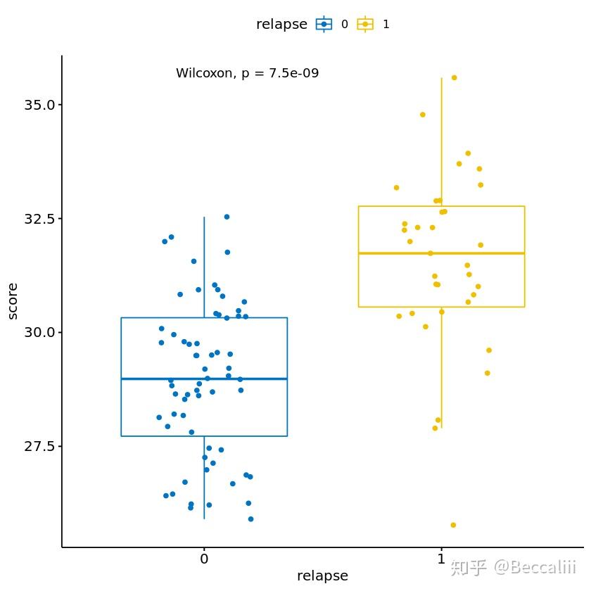

#多变量分组
library(ggplot)
ggplot(dd, aes(type, riskScore, color=factor(category), fill=type)) + geom_boxplot()

#bean plot
ggplot(data, aes(x=group, y=total_concentration, color=group)) +
  geom_violin(trim=FALSE) +geom_boxplot(width=0.1)

=================火山图======================
exprSet=eset_f
group_list=group

library(edgeR)
dge <- DGEList(counts=exprSet)
dge <- calcNormFactors(dge)
######### analysis
comp='gtMedian-ltMedian'  #after minor before
v <- voom(dge,group_list,plot=TRUE, normalize="quantile")
#v[1:4,1:10]
fit <- lmFit(v, group_list)
cont.matrix=makeContrasts(contrasts=c(comp),levels = group_list)
fit2=contrasts.fit(fit,cont.matrix)
fit2=eBayes(fit2)
#### get data
tempOutput = topTable(fit2, coef=comp, n=Inf)
DEG_limma_voom = na.omit(tempOutput)
head(DEG_limma_voom)
# logFCdone extract column 1 and 4
#save(DEG_limma_voom,file = "testset.limma.Rdata")
#write.csv(DEG_limma_voom,"testset.limma.csv")
#draw picture
library(ggplot2)
DEG=DEG_limma_voom
colnames(DEG)
plot(DEG$logFC,-log10(DEG$P.Value))
#logFC_cutoff <- with(DEG,mean(abs(logFC)) + 2*sd(abs( logFC)) )
logFC_cutoff=1  #一般设1,即2倍表达量
DEG$change = as.factor(ifelse(DEG$P.Value < 0.05 & abs(DEG$logFC) > logFC_cutoff,
                              ifelse(DEG$logFC > logFC_cutoff ,'UP','DOWN'),'NOT')
)
table(DEG$change)
this_tile <- paste0('Cutoff for logFC is ',round(logFC_cutoff,3),
                    '\nThe number of up gene is ',nrow(DEG[DEG$change =='UP',]) ,
                    '\nThe number of down gene is ',nrow(DEG[DEG$change =='DOWN',])
)
g = ggplot(data=DEG, aes(,x=logFC, y=-log10(P.Value),color=change)) + geom_point(alpha=0.4, size=1.75) +
  theme_set(theme_set(theme_bw(base_size=20)))+ xlab("log2 fold change") + ylab("-log10 p-value") +
  ggtitle( this_tile ) +   theme(plot.title = element_text(size=15,hjust = 0.5)) +
  scale_colour_manual(values = c('blue','black','red')) 	## corresponding to the levels(res$change)
print(g)
#ggsave(g,filename = 'volcano.pvalue.png')


====================热图======================
常规办,读取数据,scale数据并画图。
info<-as.data.frame(read.table("data/TIMER.csv",header = TRUE,sep = ",", dec = ".",na.strings = "NA",stringsAsFactors=FALSE,check.names = FALSE))
row.names(info)=info[,1]
info=info[,-1]
#info<-info[!rownames(info) %in% c("T cell CD4+ (non-regulatory)_QUANTISEQ"),]
head(info)
dim(info)

#检查有无全0的数据,有则删除(用上面#注释那一个命令,按列名删除)
dat=as.data.frame(info)
#dat[1:5,]
f<-function(x) sum(x==0)
#"1":按行统计0个数
d<-as.data.frame(apply(dat,1,f))
d$ID=row.names(d)
d[order(d[,1],decreasing=TRUE),]

library(ComplexHeatmap)
library(pheatmap)
aa=t(info)
aa=scale(aa)
aa=t(aa)

#图1
Heatmap(aa,cluster_rows = TRUE,show_row_names = T)
#图2
p<-pheatmap(aa,show_rownames=T, cluster_cols=T, cluster_rows=T,cex=1, clustering_distance_rows="euclidean", cex=1,clustering_distance_cols="euclidean", clustering_method="complete", border_color=FALSE,cutree_col = 3)
p
colnames(aa[,p$tree_col[["order"]]]) #按图顺序从左到右获取样本名
rownames(aa[p$tree_row[["order"]],]) #按图顺序从上到下获取特征名


按分组提取样本
p<-pheatmap(data,scale="row",show_colnames=T, show_rownames=F,cluster_cols=T, cluster_rows=T,cex=1, clustering_distance_rows="euclidean", cex=1,clustering_distance_cols="euclidean", clustering_method="complete", border_color=FALSE,cutree_col = 3)
p
cluster = cutree(p$tree_col,k=3)
#table(cluster)
as.data.frame(cluster)

进阶版,选取差异基因画热图(这样看起来更好看),同时添加额外信息在图上一并展现。
library(ComplexHeatmap)
dif = DEG_limma_voom  # 同上,只提取差异表达的即引来画图,热图会更好看
dif <- dif[dif[, "P.Value"]<0.01,]
dim(dif)
#head(dif)

library(pheatmap)
selected <- eset_f[rownames(dif), ]
#head(selected)
rownames(selected) <- dif$symbols

annotation = data.frame(value = rnorm(80))
value = info[colnames(selected),]$Yield
yield = HeatmapAnnotation(df = annotation,points = anno_points(value), annotation_height = c(1, 2))
value = info[colnames(selected),]$RIN
rin = HeatmapAnnotation(points = anno_points(value))

aa=t(selected[1:dim(dif)[1],])
aa=scale(aa)
aa=t(aa)
#pheatmap(selected[1:dim(dif)[1],],top_annotation = yield,bottom_annotation = rin, fontsize_row = 1, scale = "row", border_color = NA)
Heatmap(aa, top_annotation = yield, bottom_annotation = rin,
        cluster_rows = TRUE,show_row_names = F)
#pheatmap(selected,scale = "row",border_color = NA) #这里可以指明按行or 按列做scale(在这里是让每个基因的数值做scale),所以也可以不置换。


scale是为了让数字集中一些,避免离群值对颜色的显示有影响,让颜色分层更加平缓。一般scale()中的数据是样本在行,特征在列,如果不是的就需要先转置一下做数据处理。
热图的特殊操作
- 如果有异常值(特别大或者特别小),可以限制上限下限值避免离群值影响颜色梯度
#接在scale(aa)和t(aa)之后
aa[aa>=3]=3
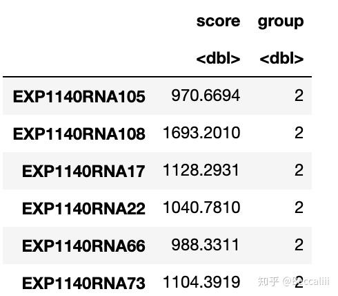
aa[aa<=-3]=-32. 计算分数并按中位数/ 按照某个数字分组
colnames(d)[1]="score"
cutoff=mean(d[,1])   #取中位数作为分隔值
cutoff
a=d[d[, "score"]>cutoff,]
b=d[d[, "score"]<=cutoff,]
a$group=2
b$group=1
score=rbind(a,b)
score=score[,-2]
table(score$group)
head(score)
=====================PCA=====================
cutoff=median(info[, "Yield"])
c=info[info[, "Yield"]>=cutoff,]
d=info[info[, "Yield"]<cutoff,]
c$label="Yield_GT"
d$label="Yield_LT"

label=rbind(c,d)
label=label[sort(colnames(eset_f)),]
dim(label)

eset_pca=t(eset_f)
eset_pca<-as.data.frame(eset_pca)
eset_pca=cbind(label[,"label"],eset_pca)
colnames(eset_pca)[1]="label"

eset_pca[1:2,]

dat=eset_pca

#install.packages('ggfortify')
library(ggfortify)

# apply PCA - scale. = TRUE is highly advisable, but default is FALSE.
#par(mfcol=c(2,2))
out_pca <- prcomp(dat[,-1],scale= TRUE)
#plot(out_pca,type="l")
autoplot(out_pca,data=dat,colour='label',size=0.1,label=TRUE,label.size=3)

#一般都会做scale,让图好看一点


# 如果是考虑根据某个数值,使PCA图表现不同的颜色(同时展现PCA和样本数值大小3个维度),可以考虑下面这个方法
data=as.data.frame(cbind(out_pca$x[,1],out_pca$x[,2]))
data$yield= info[rownames(out_pca$x),]$Yield
data[1:5,]
ggplot(data) + geom_point(aes(V1, V2, colour = yield), size = 5)+labs(x = "pc_1",y = "pc_2") +theme_bw()+scale_color_gradientn(colours = rainbow(4))


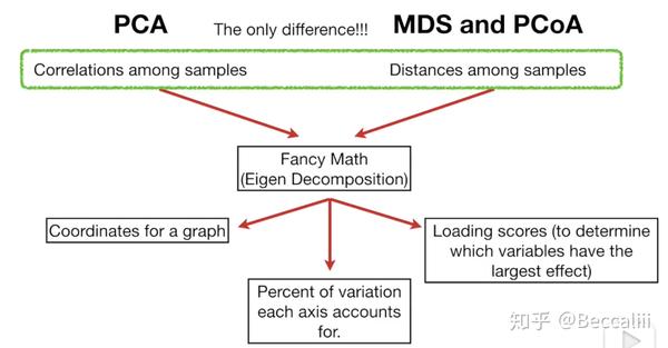
=================PCA 与 PCoA==================


=========== 表格逐一进行加减乘除计算并替换原表格===========
head(info)
#sweep(数据,1列/2行,运算的数字,"+","*","/","-")
info=sweep(data.matrix(info[,-1]),1,info$V2, FUN = "*")
head(info)

=========== 表格全部变为log形式===========
#log10 transfer
library(dplyr)
dat=as.data.frame(sweep(data.matrix(dat_rna),1,0.000001,FUN = "+"))   #log(X+0.000001)
dat_rna %>% mutate_each(funs(log10)) -> tmp
row.names(tmp)=row.names(dat_rna)
dat_rna=round(tmp,3)   #float size
tmp=""
#head(dat_rna)
dim(dat_rna)
=============boxplot/散点图加颜色加概率==============
head(tmp)

#normal distribution vs tumor distribution
library(dplyr)
library(ggplot2)
library(ggpubr)
#tmp %>% ggplot(aes(group,methy_rate,fill=group))+geom_boxplot()+geom_jitter(alpha=0.5)

compare_means(methy_rate ~ group, data = tmp)
p <- ggboxplot(tmp, x = "group", y = "methy_rate", palette = "jco",color="group",add = "jitter")
#  Add p-value
p + stat_compare_means()
# Change method
#p + stat_compare_means(method = "t.test")


library(ggplot2)
library(dplyr)
head(dat_p)
dat_p %>% ggplot(data = dat_p, mapping = aes(x = x, y = y, colour = culture))+geom_smooth(method = lm)+geom_point()


============jupyter notebook中添加 R内核 =============
#R包大部分都无法下载,添加清华镜像
> options(repos=structure(c(CRAN="https://mirrors.tuna.tsinghua.edu.cn/CRAN/")))

#命令行界面中进入R
$ R
#查看当前有的镜像
> getOption("repos")
                                        CRAN
"https://mirrors.tuna.tsinghua.edu.cn/CRAN/"

#在R中安装devtools库
install.packages('devtools')
#在R中安装IRkernel
devtools::install_github('IRkernel/IRkernel')
或 直接用 install.packages('IRkernel') 来安装

#在R中激活,
#IRkernel::installspec()
IRkernel::installspec(name = 'ir33', displayname = 'R 3.3')  #也可以设定名字,这样子可以同时存在不同版本的R
[InstallKernelSpec] Installed kernelspec ir in /home/hpli/.local/share/jupyter/kernels/ir

之后打开jupyter notebook 就能看见R了,追加一个让R更好看的包
> install.packages("formatR", repos = "http://cran.rstudio.com")
之后退出R,打开jupyter notebook,就可以用R了