Description
Need to add some kind of control over leading at the start/end of a container. See discussion at
- https://lists.w3.org/Archives/Public/www-style/2016May/0090.html
- https://lists.w3.org/Archives/Public/www-archive/2018Oct/0003.html
- https://lists.w3.org/Archives/Public/www-archive/2018Oct/0004.html
- https://lists.w3.org/Archives/Public/www-archive/2018Oct/att-0009/00-part
The use case is actual control over the amount of space between the content edge and the text, both to be able to control spacing more exactly and to be able to line the top/bottom of the text up with the top/bottom edge of a colored block or image.
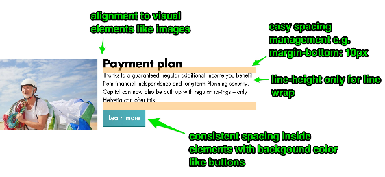
Based on Jan Nicklas’s examples (see above), it seems the control needs to be able to choose font-based top and bottom metrics to use, e.g. leading-top/ascent-top/cap-height/hanging/ideographic-top/hebrew-top/etc for the top, leading-bottom/descent-bottom/alphabetic/ideographic-bottom/etc. for the bottom so that it's possible to line up text with adjacent images, etc. and to more meaningfully control spacing between the visible text and its container's edge.
It could look something like
leading-trim-over: normal | text | cap | ex | ideographic | etc.
leading-trim-under: normal | text | alphabetic | ideographic | etc.
leading-trim: <'leading-trim-over'> <'leading-trim-under'>?
Activity
css-meeting-bot commentedon Oct 23, 2018
The CSS Working Group just discussed
Leading Control.The full IRC log of that discussion
<fantasai> Topic: Leading Control<fantasai> github: https://github.com//issues/3240
<mstange> fantasai: On that page you see some diagrams that Jan and Niklas sent me.
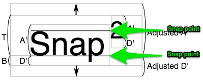
<mstange> fantasai: The problem we have in CSS that is driving a lot of typesetting people crazy is that we have above and below for text content, and it's very difficult to line up the text with other elements.
<mstange> ... You basically have to figure out how much space there is and use a negative margin. This is not a very robust system for achieving alignment.
<mstange> ... We need the ability to strip out the top part of the line box that is above the text, so that you only have leading between the lines but not above the first or below the last line.
<mstange> ... You also need to be able to strip out the half leading, which comes on top of the ascent, which is some arbitrary number that the font author put in that might not have much to do with anything.
<mstange> ... For different writing systems you want to use different metrics here.
<mstange> ... We need to strip it down to one particular font metric.
<astearns> didn't we talk about a first-baseline-offset property at some point in the past?
<mstange> ... The proposal is to add two new properties, for the over and under edge.
<mstange> ... Which strips the size of the space down to a particular font metric.
<Rossen> q?
<mstange> ... The proposal is to have leading-trim-over/under properties which strip out the space.
<Rossen> ack fantasai
<mstange> dbaron: I'm concerned about how this works if you have multiple things in a line.
<mstange> ... If the goal is to have two things to line up with each other, adding properties which help you remove one of the things that cause the misalignment helps you get there, but it is not solving the problem as directly as you'd like.
<mstange> fantasai: We also need the ability to control the line box sizing more precisely.
<mstange> dbaron: What I'm thinking is that this seems more like a use case for something like line grid, or something line grid-ish.
<mstange> fantasai: It is not about having a grid.
<mstange> ... It is about having the top align with an adjacent thing, or precisely controlling padding.
<mstange> fantasai: If I have letters in a box with padding, the amount of space between the top of the capital letters and the top of the box, visually speaking, is not the number in my padding property.
<mstange> fantasai: Having a line grid will not make that go away. It makes sure that consecutive lines have a particular rhythm, but it doesn't strip out this space.
<mstange> fantasai: The problem in the images in this issue is that the top of the text is not lining up.
<mstange> dbaron: One of them is about getting two things to line up, and one of them is about getting uniform spacing around something.
<mstange> fantasai: The distance between the content box top edge and the text as you see it visually is not controllable by the author.
<astearns> (agrees with fantasai fwiw - this seems useful with or without a grid)
<florian> q+
<mstange> dauwhe: I've seen this problem in my work.
<mstange> fantasai: Our job is to make it so that you don't need JavaScript to do basic layout.
<mstange> fantasai: (Comparing to initial letter:) We do very precise alignment for initial letter. It is not about measuring the space, it is about getting the browser leave enough space.
<dbaron> I actually didn't finish saying what I was trying to say
<mstange> koji: Would like to have these metrics be accessible from both CSS layout and from an API.
<mstange> dbaron: What I was wondering is whether this is going to make other things that we want to do in this space harder.
<mstange> dbaron: Is this an independent thing that is going to be able to float on its own or does it make other things more complicated?
<mstange> ... It's probably ok but I'm a bit worried about it.
<mstange> fantasai: If your concern is about the line grid stuff, this is just about helping to set where that line grid starts.
<mstange> ... Line grid snaps baselines. Whatever calculation we do here is not going to affect the ability to snap things to baselines.
<mstange> ... And step sizing works on the margin box, so it's not going to be badly affected by this either.
<mstange> florian: Detail: This needs to apply to the first and last lines in the paragraph, and not just to the direct children.
<mstange> ... This is not a problem with the design, but should be explained.
<mstange> ... If you have several paragraphs, you want this to apply to the first line of the first paragraph, not to each paragraph.
<mstange> dbaron: So you're saying it should be a non-inherited property that applies to the element that has the first line.
<jensimmons> if this is helpful to anyone, I just wrote this demo to help me: https://codepen.io/jensimmons/pen/GYYpvN
<dbaron> s/element that has the first line/first formatted line/
<mstange> koji: I support it.
<mstange> Resolved: Add a leading trimming feature to the CSS inline spec.
<dbaron> Probably most people will mispronounce "leading" when they see it...
<astearns> they do
<astearns> maybe line-height-trim instead?
litherum commentedon Oct 23, 2018
How does it react to fragmentation?
litherum commentedon Oct 23, 2018
What does leading-trim-under: alphabetic mean?
WestonThayer commentedon Oct 23, 2018
Another common pain point today is vertical centering. It's easy to vertically center the text container to an icon, but that often isn't the intended visual effect:
What I usually want is:
leading-trimwould enable some new possibilities, like swapping out fonts without breaking the design intent:WestonThayer commentedon Oct 23, 2018
Microsoft's XAML has a very similar notion to
leading-trimon their<TextBlock />, a property called TextLineBounds.WestonThayer commentedon Oct 23, 2018
I wanted to share one more situation—in multi-column layouts, I often wish I could set the top margin directly to the baseline to make sure make sure two bits of differently sized text are base-aligned:
Something like
leading-trim-over: ideographic-bottomwould let you easily achieve baseline alignments while sticking to a standard spacing convention (for example, increments of 10px).tobireif commentedon Oct 26, 2018
Related: #2228
tobireif commentedon Oct 26, 2018
I need to be able to ensure 100% consistent text-positioning across platforms (eg for very large words), especially regarding the effective y-position of the glyphs, even if the font file states something else or can be considered "broken". The list of workarounds include using SVG text, or eg manually setting eg negative/positive margin-top / margin-bottom per OS/browser.
More info, screenshots, test-pages etc at #2228 .
Will the feature proposed in the ticket here offer that? Including in cases where there's nothing to snap to / align to?
fantasai commentedon Oct 27, 2018
@WestonThayer Wrt #3240 (comment) Is that an actual multi-column layout or is it multiple columns like we have e.g. in grid or flexbox or float layouts, where the column breaks are not due to fragmenting a single flow but due to placing two elements side-by-side? Because in the latter case we have the
baselinealignment values. Trying to do it in the actual multicol case would need... some thought, and possibly an actual baseline grid. I don't think this feature would work well for it, because if the second headline doesn't wrap to the next column, you want a different sort of spacing than you need to get the baselines to line up.fantasai commentedon Oct 27, 2018
@litherum Fragmentation is an interesting case. It's quite reasonable to want the text-trim to take effect at fragmentation breaks in multicol. But for pages, we'd end up trimming any ink that leaks over. We'll either need to adjust css-page-3 to not trim overflow at fragmentation boundaries or add a page-padding property similar to scroll-padding or something. This is actually necessary for ruby to work properly in Japanese, and many other effects that require the top of the text to line up across fragmentainers but allows some lines to contain content that overflows that visual line.
fantasai commentedon Oct 27, 2018
@litherum
alphabeticmeans we trim to the alphabetic baseline. So descenders would overflow the line (similar to ascenders overflowing the cap height if leading-trim-over: cap is specified). It would allow the effects @WestonThayer describes in #3240 (comment), among other things, while still preserving inter-line spacing if that text wraps to multiple lines.fantasai commentedon Oct 27, 2018
@tobireif It won't affect inter-line spacing within the same block, but it can help with that kind of problem between blocks, yes.
WestonThayer commentedon Oct 30, 2018
@fantasai re: #3240 (comment) good question, no I didn't intend my example to be a multi-column layout, rather positioning two elements side-by-side.
I often find it difficult to achieve this effect using the
baselinealignment value because the bits of text I want base-aligned often do not share the same alignment context. For example, consider this design that uses the "card" UI pattern:Because it's most convenient to enclose the headlines within a
<div>(to set the background, border, and padding), the<div>ends up being what shares the alignment context within a layout container like Grid or Flexbox that has access to thebaselinealignment value.43 remaining items