Skip to content
New issue

Have a question about this project? Sign up for a free GitHub account to open an issue and contact its maintainers and the community.

By clicking “Sign up for GitHub”, you agree to our terms of service and privacy statement. We’ll occasionally send you account related emails.

Already on GitHub? Sign in to your account

[css] 第1天 圣杯布局和双飞翼布局的理解和区别,并用代码实现 #2

Open
haizhilin2013 opened this issue Apr 17, 2019 · 56 comments
Labels
css css

Comments

@haizhilin2013
Copy link
Collaborator

[css] 第1天 圣杯布局和双飞翼布局的理解和区别,并用代码实现

@undefinedYu
Copy link
Contributor

一:
section{height: 100%; overflow: hidden;clear:both; }
.left{ height: 100%;float:left;width:30%;background: #f00; }
.right{ height: 100%;float:right;width:30%; background: #0f0; }
.center{ height: 100%;background: #00f;}


二:
section{ height: 100%;display: flex;justify-content: center;align-items: center;}
.left{ height: 100%;flex-basis: 30%;background: #f00; }
.right{ height: 100%;flex-basis: 30%;background: #0f0; }
.center{ height: 100%;background: #00f; }


三:
section{ height: 100%;position: relative;}
.left{ height: 100%;width: 30%;background: #f00;position: absolute;left:0;top:0; }
.right{ height: 100%;width: 30%;background: #0f0;position: absolute;right:0;top:0; }
.center{ height: 100%;background: #00f;margin:0 30%; }


@yxkhaha
Copy link

yxkhaha commented Apr 17, 2019

圣杯布局:
DOM:

header
left
圣杯布局
right

CSS:

<style> *{ margin: 0; padding: 0; } body{ color: #fff; } #header{ width: 100%; height: 100px; text-align: center; line-height: 100px; background: #333; } #footer{ width: 100%; height: 100px; text-align: center; line-height: 100px; background: #333; } #content{ display: flex; flex-direction: row; } #content .left{ width: 180px; height: 200px; background: green; text-align: center; line-height: 200px; } #content .middle{ width: 100%; height: 200px; background: skyblue; color: red; } #content .right{ width: 180px; height: 200px; background: green; text-align: center; line-height: 200px; } </style>

@haizhilin2013
Copy link
Collaborator Author

发现了大家一个问题,就是大家不怎么会用markdown,这周五可以讲讲了

@qingleizhang123
Copy link

   作用:圣杯布局和双飞翼布局解决的问题是一样的,就是两边顶宽,中间自适应的三栏布局,中间栏要在放在文档流前面以优先渲染。
  区别:圣杯布局,为了中间div内容不被遮挡,将中间div设置了左右padding-left和padding-right后,将左右两个div用相对布局position: relative并分别配合right和left属性,以便左右两栏div移动后不遮挡中间div。双飞翼布局,为了中间div内容不被遮挡,直接在中间div内部创建子div用于放置内容,在该子div里用margin-left和margin-right为左右两栏div留出位置。

圣杯布局代码:

<body>
<div id="hd">header</div>
<div id="bd">
  <div id="middle">middle</div>
  <div id="left">left</div>
  <div id="right">right</div>
</div>
<div id="footer">footer</div>
</body>

<style>
#hd{
    height:50px;
    background: #666;
    text-align: center;
}
#bd{
    /*左右栏通过添加负的margin放到正确的位置了,此段代码是为了摆正中间栏的位置*/
    padding:0 200px 0 180px;
    height:100px;
}
#middle{
    float:left;
    width:100%;/*左栏上去到第一行*/
    height:100px;
    background:blue;
}
#left{
    float:left;
    width:180px;
    height:100px;
    margin-left:-100%;
    background:#0c9;
    /*中间栏的位置摆正之后,左栏的位置也相应右移,通过相对定位的left恢复到正确位置*/
    position:relative;
    left:-180px;
}
#right{
    float:left;
    width:200px;
    height:100px;
    margin-left:-200px;
    background:#0c9;
    /*中间栏的位置摆正之后,右栏的位置也相应左移,通过相对定位的right恢复到正确位置*/
    position:relative;
    right:-200px;
}
#footer{
    height:50px;
    background: #666;
    text-align: center;
}
</style>

双飞翼布局代码:

<body>
<div id="hd">header</div> 
  <div id="middle">
    <div id="inside">middle</div>
  </div>
  <div id="left">left</div>
  <div id="right">right</div>
  <div id="footer">footer</div>
</body>

<style>
#hd{
    height:50px;
    background: #666;
    text-align: center;
}
#middle{
    float:left;
    width:100%;/*左栏上去到第一行*/     
    height:100px;
    background:blue;
}
#left{
    float:left;
    width:180px;
    height:100px;
    margin-left:-100%;
    background:#0c9;
}
#right{
    float:left;
    width:200px;
    height:100px;
    margin-left:-200px;
    background:#0c9;
}

/*给内部div添加margin,把内容放到中间栏,其实整个背景还是100%*/ 
#inside{
    margin:0 200px 0 180px;
    height:100px;
}
#footer{  
   clear:both; /*记得清楚浮动*/  
   height:50px;     
   background: #666;    
   text-align: center; 
} 
</style>

@haizhilin2013
Copy link
Collaborator Author

点评:
知识点:最经典的三栏布局,也称为固比固布局
难点:1颗星
这道题主考查布局的了解,同时也考查margin负值的情况

@haizhilin2013 haizhilin2013 added the css css label Apr 18, 2019
@hellojackhui
Copy link

https://lhammer.cn/You-need-to-know-css/#/zh-cn/holy-grail-layout?v=1
https://lhammer.cn/You-need-to-know-css/#/zh-cn/double-wing-layout?v=1
这个讲的挺好的

@tzjoke
Copy link

tzjoke commented May 16, 2019

两者都是为了不让左右俩不遮住middle,经典圣杯布局通过父亲padding给左右俩腾位置从而不会遮住middle内容,而双飞翼是middle设置margin,限制内部内容区域,从而左右俩遮的地方不会影响到middle内容

对于三栏布局,modern solution是 flex box/ grid 布局,这两者可以轻松实现 mobile-friendly的方案,也可以控制顺序,middle依然可以先渲染,9012年兼容性不错了,如果APP无视IE,这是优选

这一颗星我拿走啦 😜

@haizhilin2013 感谢大佬整理,最近想tc很有用 👍

btw大佬不打算开个answer repo吗?

@SSypp
Copy link

SSypp commented May 18, 2019

理解:简单粗暴点,就是说左右两边的宽度不随着浏览器窗口的变化而变化,是固定的,只有中间的部分才可以随着窗口变化而变化,总结:固比固
有的人根据float来实现类这样的布局,出现的结果是固固固或者比比比,而不是我们所说的固比固,这个需要注意

@douxiaohou
Copy link

douxiaohou commented Jun 4, 2019

实现的方式比较多吧 浮动、定位都可以实现,定位实现

<style> .wrap{ position: relative; height: 200px; background: #CCCCCC; width: 100%; } .left, .right{ width: 200px; height: 200px; background: red; position: absolute; left: 0; top: 0; } .right{ right: 0; } .center{ height: 200px; background: black; margin: 0 200px; } </style>

@Splendid-life
Copy link

flex大法

@zoneasa
Copy link

zoneasa commented Jul 4, 2019

1.都是解决两边定宽,中间自适应的三栏布局解决方案,中间栏放在文档流前面 让浏览器自上而下优先渲染。
2.三栏都设置成左浮动,中间栏100%宽度,左右栏设置具体宽度
3.圣杯布局 中间栏左右设置padding,左栏margin-left -100%,然后position:relative;�left:-leftWidth;右栏margin-left:-rightWidth;
双飞翼布局 中间栏加一个inside容器,内部容器margin-left,margin-right让中间栏内容不被挡住,也给左右栏让出位置。左侧栏只需设置margin-left:-100%,右侧栏margin-left:-rightWidth

@shufangyi
Copy link

[css] 第1天 圣杯布局和双飞翼布局的理解和区别,并用代码实现

两者解决类似的问题。主要解决左右定宽,中间自适应的三栏布局。并且中间栏优先渲染。

圣杯布局

三栏利用 float 和 负margin 并列
利用父容器设置 padding 给两边侧栏腾空间

    <div class="wrapper1">
      <div class="main">
        <p>bilibili</p>
      </div>
      <div class="left"></div>
      <div class="right"></div>
    </div>
  * {
    padding: 0;
    margin: 0;
  }
  .wrapper1 {
    padding: 0 60px 0 30px;
  }
  .wrapper1 .main {
    float: left;
    width: 100%;
    height: 300px;
    background: red;
  }
  .wrapper1 .left {
    float: left;
    width: 30px;
    margin-left: -100%;
    background: blue;
    height: 100px;
    position: relative;
    right: 30px;
  }
  .wrapper1 .right {
    float: left;
    width: 60px;
    margin-left: -60px;
    background: yellow;
    height: 200px;
    position: relative;
    left: 60px;
  }

双飞翼布局

三栏利用 float 和 负margin 并列
在中间栏加一层容器,利用 margain 给两栏腾空间

    <div class="wrapper2">
      <div class="container">
        <div class="main">
          <p>bilibili</p>
        </div>
      </div>
      <div class="left"></div>
      <div class="right"></div>
    </div>
  * {
    padding: 0;
    margin: 0;
  }
  .wrapper2 {
    min-width: 630px;
  }
  .wrapper2 .container {
    float: left;
    width: 100%;
  }
  .wrapper2 .container .main {
    height: 300px;
    background: red;
    margin: 0 600px 0 30px;
  }
  .wrapper2 .left {
    float: left;
    width: 30px;
    background: blue;
    height: 100px;
    margin-left: -100%;
  }
  .wrapper2 .right {
    float: left;
    width: 600px;
    background: yellow;
    height: 200px;
    margin-left: -600px;
  }

PS:现在用 flex 的了

@seho-dev
Copy link

简要描述圣杯布局和双飞翼布局的区别和你自己的理解;并实现它们圣杯布局和双飞翼布局都是经典的三栏布局,它们都是解决了,左右两列等宽,中间自适应的布局方式;中间的往往是最优先加载的,所以要把dom放在left和right前面;区别:为了不会造成中间的div的文字被旁边遮挡,圣杯布局采用的是父级div给padding-left和right限制,让字不会被左边和右边挡住;双飞翼布局是采用给中间的div添加一个小div,这个小div使用内边距;圣杯布局优缺点:优点:不需要添加dom节点缺点:圣杯布局的缺点:正常情况下是没有问题的,但是特殊情况下就会暴露此方案的弊端,如果将浏览器无线放大时,「圣杯」将会「破碎」掉。如图,当main部分的宽小于left部分时就会发生布局混乱。(main<left即会变形)双飞翼布局优缺点:目的:为了优先显示中间主要部分,浏览器渲染引擎在构建和渲染渲染树是异步的(谁先构建好谁先显示),故在编写时,先构建中间main部分,但由于布局原因,将left置于center左边,故而出现了双飞翼布局。优点:不会像圣杯布局那样变形缺点是:多加了一层dom节点采用的方法有很多,这边只列举,浮动和margin,只允许我写思路,具体自己实现;.box>div {float: left;}.box {background: yellow;/* 圣杯布局 // padding-left: 200px; // padding-right: 200px; */}.middle {background: red;margin-left: 200px;margin-right: -200px;width: 70%;height: 100px;}.left {background: pink;width: 200px;height: 100px;margin-left: -70%}.right {background: blue;width: 200px;height: 100px;margin-right: -200px}
双飞翼布局

inside{
margin:0 200px 0 180px;
height:100px;
}

@Toeat
Copy link

Toeat commented Aug 2, 2019

相同

1.圣杯和双飞翼都满足3列中列自适应的布局
2.低于最小宽度都会布局错乱

不同

1.圣杯是用容器包裹三列,双飞翼是3列分开布局
2.圣杯使用position防遮挡,双飞翼css相对简洁只需使用负边距定位即可

圣杯html

<div id="container">
    <div id="center" class="column">1111</div>
    <div id="left" class="column">222</div>
    <div id="right" class="column">333</div>
</div>

圣杯css

body {min-width: 550px;}
#container {padding-left: 200px;padding-right: 150px;}
#container .column {position: relative;float: left;}
#center {width: 100%;}
#left {width: 200px; right: 200px;margin-left: -100%;}
#right {width: 150px;margin-right: -150px;}

双飞翼html

<div id="container" class="column">
    <div id="center">1111</div>
</div>
<div id="left" class="column">222</div>
<div id="right" class="column">333</div>

双飞翼css

body {min-width: 500px;}
#container {width: 100%;}
.column {float: left;}
#center {margin-left: 200px;margin-right: 150px;}
#left {width: 200px; margin-left: -100%}
#right {width: 150px; margin-left: -150px;}

@seho-dev
Copy link

理解:圣杯布局和双飞翼布局都是为了解决两边定宽,中间自适应且优先渲染的布局需求,那么为了自适应且优先渲染,必须要把中间的dom放在最顶端,以保证主要内容能最先被浏览器解析;

而圣杯布局的核心概念就是,通过父容器撑出左右2个 “预留区域”

微信截图_20190818135602.png

圣杯布局代码(在线调试): https://codesandbox.io/embed/red-platform-vtrct
总结圣杯布局:圣杯布局的核心就是父盒子用padding预留区域,然后center设置宽100%,并且把中左右3个盒子浮动,由于浮动的效果且中间center的宽度沾满了全部,所以左右两个盒子会被“挤下去”,我们需要把2个盒子放到padding给它们预留的地方,左边盒子先使用margin-right负值100%移动到父盒子中心(和中盒子共享第一行,其实就是盖住了中盒子的一半,因为有浮动的原因脱离了文档流)然后再可以使用定位向左移动padding的宽度,就把左盒子移动到了预留的padding中了,右盒子就是直接给一个margin-right负值(父值得值就是预留的padding大小)

双飞翼布局 (在线调试) : https://codesandbox.io/embed/elated-kilby-6vqjp
总结双飞翼布局:双飞翼布局的核心就是center通过包裹一个父元素,给父元素设置width: 100%和浮动,子元素用margin撑出其他两块的预留位置,然后在left和right上,通过margin-right负值进行移动到对应位置上;

两种布局方式的总结:个人来讲圣杯布局在dom上能够更清爽且更能让人理解,但是在css实现上比较复杂难懂,但是双飞翼布局在dom上没有圣杯那么容易懂,但是在css实现上更让人理解,不难发现,2种布局方式都需要引入一个div,因为(既要设置中间的浮动且可以设置宽度又能计算预留位置),基于双飞翼布局,我们可以通过calc函数(ie9已支持),把多余的div去掉,可以使用calc(100% - 400px)这样的方式就可以自适应啦,但是需要牺牲兼容性,同理还可以用border-box和flex布局,具体移步: https://www.jianshu.com/p/81ef7e7094e8

我的这次总结有少数代码和部分借鉴此处,尤其是给大家提供了不考虑兼容性情况下,如何用额外的方法布局;

@yuy1guo
Copy link

yuy1guo commented Sep 29, 2019

详解推荐看这篇:
https://www.php.cn/css-tutorial-389529.html
圣杯布局与双飞翼布局主要在解决中栏不被遮挡的思路不同

@RQSA
Copy link

RQSA commented Oct 3, 2019

1、简述:圣杯与双飞翼布局的区别
圣杯布局:将页面划分为头部、内容、底部,内容分为左中右,主要思路是朝着一个方向浮动(float:left),在利用负margin(左栏margin-left:-100%;右栏margin-left:-右宽度像素值)与设置左右栏相对定位,为了避免中间里面内容被拉上来的挡住再对中间内容设置padding来实现。
双飞翼布局:与圣杯类似,其不同点就是给中间内容添加父级容器,这样可以省略对左右栏设置相对定位

@liu12fei08fei
Copy link

圣杯布局和双飞翼布局的理解和区别,并用代码实现

名称

  • box表示块级框的class
  • middle表示中间模块
  • left表示左侧aside
  • right表示右侧aside

原理相同

  • 先使用float:left;让所有模块称为一个块级框(float概念);即:让所有模块在一行展示
  • 为了middle模块的自适应,都采用了width:100%;实现
  • 都是用margin-left来把固定模块移动到指定位置

不同

  • 页面横向空间(块级框)利用率不同
  • 这也是圣杯布局存在的最大问题(当middle宽度小于left的时候,布局被破坏)

圣杯-代码

<style>
  /*demo样式,方便查看,非原理代码*/
  header,footer{background:pink;color:#fff;}
  .box{overflow:hidden;}
  .box>div{float:left;color:#fff;}
  .middle{background:purple;}
  .left{background:blue;width:200px;height:300px;}
  .right{background:green;width:300px;height:400px;}
  /*原理+思路代码*/
  .box{padding-left:200px;padding-right:300px;}
  .left,.right{position:relative;}
  .middle{width:100%;}
  .left{margin-left:-100%;left:-200px;}
  .right{margin-left:-300px;left:300px;}
</style>
<header>header</header>
<div class="box">
  <div class="middle">middle</div>
  <div class="left">left</div>
  <div class="right">right</div>
</div>
<footer>footer</footer>

双飞翼-代码

增加了middle_main,提高了middle空间利用率

<style>
  /*demo样式,方便查看,非原理代码*/
  header,footer{background:pink;color:#fff;}
  .box{overflow:hidden;}
  .box>div{float:left;color:#fff;}
  .middle{background:purple;}
  .left{background:blue;width:200px;height:300px;}
  .right{background:green;width:300px;height:400px;}
  /*原理+思路代码*/
  /*.box{padding-left:200px;padding-right:300px;}*/
  /*.left,.right{position:relative;}*/
  .middle{width:100%;}
  .left{margin-left:-100%;
    /*left:-200px;*/
  }
  .right{margin-left:-300px;
    /*left:300px;*/
  }
  /*新增*/
  .middle_main{margin-left:200px;margin-right:300px;}
</style>
<header>header</header>
<div class="box">
  <div class="middle">
    <div class="middle_main">middle</div>
  </div>
  <div class="left">left</div>
  <div class="right">right</div>
</div>

减少dom-双飞翼

我们使用box-sizing来减少这个dom

<style>
  /*demo样式,方便查看,非原理代码*/
  header,footer{background:pink;color:#fff;}
  .box{overflow:hidden;}
  .box>div{float:left;color:#fff;}
  .middle{background:purple;}
  .left{background:blue;width:200px;height:300px;}
  .right{background:green;width:300px;height:400px;}
  /*原理+思路代码*/
  /*.box{padding-left:200px;padding-right:300px;}*/
  /*.left,.right{position:relative;}*/
  .middle{width:100%;}
  .left{margin-left:-100%;
    /*left:-200px;*/
  }
  .right{margin-left:-300px;
    /*left:300px;*/
  }
  /*新增*/
  .middle{padding-left:200px;padding-right:300px;box-sizing:border-box;}
</style>
<header>header</header>
<div class="box">
  <div class="middle">middle</div>
  <div class="left">left</div>
  <div class="right">right</div>
</div>
<footer>footer</footer>

Other

  • 使用定位也可以
  • 缺点是aside高度一定在middle的范围内
  • 定位无法支撑起页面高度

@yyz841875845
Copy link

用flex 可以吗,左右 width 200px; 中间 flex: 1 ,最外层, display: flex

@liwudi
Copy link

liwudi commented Jan 16, 2020

1,目前比较好用的方式,是使用flex布局。
2,针对老版本的浏览器,flex可能有兼容问题,而传统的圣杯布局和双飞翼布局,就是解决两边固定,中间自适应的方式进行解决问题。
3,圣杯布局的解决思路:左右两边,以及中间的盒子,使用float:left的方式,进行浮动,同时,让middle中间盒子有一个padding值,left和right盒子通过margin-left属性以及定位的方式,实现效果。
4,他们的区别在于:双飞翼布局会在middle盒子中,再嵌套一层,然后left和right不再需要定位的方式进行平移。只需要margin-left值的设置。

关于双飞翼布局的代码

.box {
height: 500px;
}
.middle-box {
float: left;
padding: 0 100px;
height: 100%;
width: 100%;
box-sizing: border-box;
}
.middle {
background: red;
width: 100%;
height: 100%;
}
.left {
background: blue;
width: 100px;
float: left;
height: 100%;
position: relative;
margin-left: -100%;
}
.right {
background: aquamarine;
width: 100px;
float: left;
height: 100%;
position: relative;
margin-left: -100px;
}

最后:这个题目应该还牵扯到浮动的问题,清除浮动有两种方式:
1,使用overflow:hidden的方式,进行触发bfc,解决浮动。这种方式的缺点是,对于高度固定的盒子,当子元素过多的情况下,会隐藏多余的子元素。
2、使用clear:both,使用伪类选择器的方式,清除浮动。

@jasonzhouu
Copy link

jasonzhouu commented Mar 11, 2020

用flexbox实现圣杯布局,代码很直观,进行2次flex排列:

  • 上中下:flex-direction=column
    • 中间部分 flex-grow=1,占据所有剩余空间
    • 上下部分 flex-grow=0(默认值,可以不设置)
  • 左中右:flex-direction=row(默认值)
    • 中间部分flex-grow=1,占据所有剩余空间;
    • 左右边栏flex-grow=0(默认值),基准尺寸 flex-basis=100px;
    • 左边栏order=-1(负一),从而排在最前。

image
image
参考:https://philipwalton.github.io/solved-by-flexbox/demos/holy-grail/

@giggleCYT
Copy link

都是三栏布局,圣杯布局三个盒子放在同一个父盒子,需要使用定位;双飞翼布局中间一栏单独放在一个父盒子,其父盒子与左右两栏是兄弟
圣杯布局在DOM结构上显得更加直观和自然,且在日常开发过程中,更容易形成这样的DOM结构,而双飞翼布局在实现上由于不需要使用定位,所以更加简洁,且允许的页面最小宽度通常比圣杯布局更小

@IOLOII
Copy link

IOLOII commented Jun 4, 2020

笔记

<style scoped lang="scss"> *{ margin: 0; padding: 0; } .container{ padding: 0 200px; .main{ width: 100%; position: relative; float: left; } .left{ width: 200px; position: relative; float: left; margin-left: -100%; left: -200px; } .right{ width: 200px; position: relative; float: left; margin-left: -200px; right: -200px; } } </style>
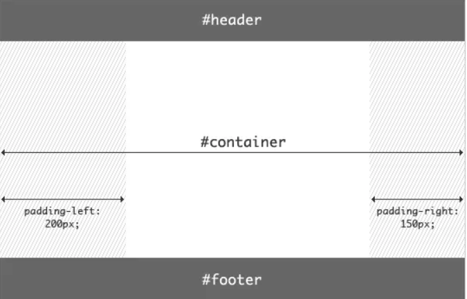
@OriX0
Copy link

OriX0 commented Jun 27, 2020

作用:

两种布局用于解决的问题是一样的:两边顶宽 中间自适应的三栏布局 中间栏要放在文档前面以优先渲染

区别:

让中间内容不被遮蔽的手法
  • 圣杯布局:父亲元素padding腾位置
    外层父元素设置padding-left & padding-right 让父元素增大
    配合margin将元素定位到指定位置 再配合相对定位 和right和left属性
    从而实现中间内容不被遮蔽
  • 双飞翼布局:
    元素margin 设置
    中间内容使用margin 但是直接设置会导致布局混乱 从而让中间内容用一个元素进行包裹后再使用margin 则其不会扰乱元素

实现

圣杯布局

DOM

<body>
  <main>
    <header class="header">
      Header
    </header>
    <section class="container">
      <div class="center column">center</div>
      <div class="left column">Left</div>
      <div class="right column">Right</div>
    </section>
    <footer>
      Footer
    </footer>
  </main>
</body>

样式

  body {
    min-width: 550px;
  }

  header,
  footer {
    height: 50px;
    background-color: #666;
  }

  .container {
    padding-left: 200px;
    padding-right: 150px;
  }

  .column {
    float: left;
    height: 200px;
  }

  .center {
    width: 100%;
    background-color: skyblue;
  }

  .left {
    width: 200px;
    margin-left: -100%;
    position: relative;
    right: 200px;
    background-color: orange;
  }

  .right {
    width: 150px;
    margin-right: -150px;
    background-color: pink;
  }

  footer {
    clear: both;
  }
双飞翼布局

DOM

<body>
  <main>
    <header class="header">
      Header
    </header>
    <section class="container">
      <div class="wrapper column">
        <div class="center ">center</div>
      </div>
      <div class="left column">Left</div>
      <div class="right column">Right</div>
    </section>
    <footer>
      Footer
    </footer>
  </main>
</body>

样式

  header,
  footer {
    height: 100px;
    background-color: #ccc;
    text-align: center;
  }
  .wrapper {
    width: 100%;
  }

  .column {
    float: left;
    height: 200px;
  }

  .center {
    margin-left: 200px;
    margin-right: 150px;
    height: inherit;
    background-color: skyblue;
  }

  .left {
    width: 200px;
    margin-left: -100%;
    background-color: pink;
  }

  .right {
    width: 150px;
    margin-left: -150px;
    background-color: orange;
  }

  footer {
    clear: both;
  }

@RaoHai
Copy link

RaoHai commented Aug 13, 2020

没人用 grid 写一个么 :D

@jejuin
Copy link

jejuin commented Aug 31, 2020

@githubzml
Copy link

圣杯布局 双飞翼布局

  1. 相同点 两边定宽 中间自适应 中间部分优先加载
  2. 不同点
    圣杯 利用padding positive
    双飞翼 多一层标签

flex方式

css

html,
body {

    margin: 0;
    padding: 0;

}

main {

    display: flex;
    height: 300px;

}

.center {

    order: 0;
    flex: 1;
    background-color: thistle;

}

.left {

    order: -1;
    width: 100px;
    background-color: saddlebrown;

}

.right {

    order: 1;
    width: 100px;
    background-color: navajowhite;

}
<main>
    <div class="center contain">center</div>
    <div class="left contain">left</div>
    <div class="right contain">right</div>
</main>

grid方式
css

body {

    margin: 0;
    padding: 0;

}

main {

    display: grid;
    height: 300px;
    grid-template-columns: 100px auto 100px;
    grid-template-areas: "left center right";

}

.center {

    grid-area: center;
    background-color: thistle;

}

.left {

    grid-area: left;
    background-color: saddlebrown;

}

.right {

    grid-area: right;
    background-color: navajowhite;

}
    <main>
        <div class="center contain">center</div>
        <div class="left contain">left</div>
        <div class="right contain">right</div>
    </main>

@luneShaoGM
Copy link

luneShaoGM commented Jan 15, 2021

共同点:
  1. 盒子排放顺序都是 中、左、右;
<div class="container">
    <div class="center">
      center
    </div>
    <div class="left">
      left
    </div>
    <div class="right">
      right
    </div>
  </div>
  1. 中、左、右三个盒子都是左浮动;
  2. 中间盒子宽 100%,左右盒子定宽;
  3. 左盒子 margin-left: -100%;,右盒子 margin-left: -右盒子宽
区别:
  • 圣杯布局:利用 container 设置 padding ,压缩盒子内的空间,左右留出空间。左盒子设置 margin-left: -100% 后会和中间盒子重叠,所以还要再用定位向左偏移左盒子宽度。右盒子设置 margin-left: -右盒子宽 会与中间盒子重叠,所以要向右偏移右盒子宽度。
  • 双飞翼布局:inner 设置 margin 后,左盒子设置 margin-left: -100%恰好到左边空出的位置,右盒子margin-left: -右盒子宽恰好到右边空出位置。
理解:
  • 圣杯布局:container 盒子像一个容器一样,设置 padding 为左、右盒子留出空间,余下的是center 部分。
  • 双飞翼布局:center 内再加一个 inner 容器设置 margin,想一只鸟的双翼,为左右盒子留出空间。

@sunnysyy
Copy link

圣杯布局和双飞翼布局的共同点:实现左右两栏固定宽度、中间栏自适应的三栏布局
不同点: 圣杯布局存在缺陷,当浏览器屏幕缩小时,中间栏的宽度小于左边栏的宽度,三栏位置会发生错乱,双飞翼布局的出现就是为了解决这个问题
代码实现如下:
1、圣杯布局
css代码:
header, footer {
height: 50px;
background-color: aqua;
}

    .container {
        padding: 0 200px;
    }

    .left {
        position: relative;
        left: -200px;
        float: left;
        margin-left: -100%;
        width: 200px;
        height: 200px;
        background-color: coral;
    }

    .middle {
        position: relative;
        float: left;
        width: 100%;
        height: 200px;
        background-color: teal;
    }

    .right {
        position: relative;
        right: -200px;
        float: left;
        margin-left: -200px;
        width: 200px;
        height: 200px;
        background-color: yellow;
    }

    .clearfix::after {
        content: '';
        display: block;
        clear: both;
    }

html代码:

头部
中间自适应
左边
右边
底部

2、双飞翼布局
css代码:
header, footer {
height: 50px;
background-color: aqua;
}

    .col {
        float: left;
    }

    .left {
        margin-left: -100%;
        width: 200px;
        height: 200px;
        background-color: bisque;
    }

    .middle {
        width: 100%;
        background-color: teal;
    }

    .middle-wrap {
        margin: 0 200px;
        height: 200px;
    }

    .right {
        margin-left: -200px;
        width: 200px;
        height: 200px;
        background-color: yellow;
    }

    .clearfix::after {
        content: '';
        display: block;
        clear: both;
    }

html代码:

header


middle


left

right


footer

@378406712
Copy link

378406712 commented Apr 19, 2021

// 双飞翼

<div class="middle fl">
  <div class="insider">middle</div>
</div>
<div class="left fl">left</div>
<div class="right fl">right</div>
<style> * { margin: 0; padding: 0; } .fl { float: left; } .middle { width: 100%; height: 200px; background-color: red; } .insider { margin: 0 200px 0 150px; } .left { width: 150px; height: 200px; background-color: green; margin-left: -100%; } .right { width: 200px; height: 200px; background-color: blue; margin-left: -200px; } </style>

// 圣杯

left
middle
right
<style> * { margin: 0; padding: 0; } .container { padding: 0 200px 0; height: 200px; text-align: center; line-height: 200px; } .fl { float: left; } .middle { width: 100%; height: 200px; background-color: red; } .left { height: 200px; width: 200px; background-color: blue; margin-left: -100%; position: relative; left: -200px; } .right { height: 200px; width: 200px; background-color: green; margin-left: -200px; position: relative; right: -200px; } </style>

@378406712
Copy link

378406712 commented Apr 19, 2021

// 弹性布局实现

<style> .container { height: 200px; display: flex; } .left { width: 100px; background-color: green; } .right { width: 200px; background-color: blue; } .middle { flex: 1; background-color: red; } </style>
<div class="container">
  <div class="left">left</div>
  <div class="middle">middle</div>
  <div class="right">right</div>
</div>

@inksnowhailong
Copy link

 作用:圣杯布局和双飞翼布局解决的问题是一样的,就是两边顶宽,中间自适应的三栏布局,中间栏要在放在文档流前面以优先渲染。
  区别:圣杯布局,为了中间div内容不被遮挡,将中间div设置了左右padding-left和padding-right后,将左右两个div用相对布局position: relative并分别配合right和left属性,以便左右两栏div移动后不遮挡中间div。双飞翼布局,为了中间div内容不被遮挡,直接在中间div内部创建子div用于放置内容,在该子div里用margin-left和margin-right为左右两栏div留出位置。

@mono2048
Copy link

   作用:圣杯布局和双飞翼布局解决的问题是一样的,就是两边顶宽,中间自适应的三栏布局,中间栏要在放在文档流前面以优先渲染。
  区别:圣杯布局,为了中间div内容不被遮挡,将中间div设置了左右padding-left和padding-right后,将左右两个div用相对布局position: relative并分别配合right和left属性,以便左右两栏div移动后不遮挡中间div。双飞翼布局,为了中间div内容不被遮挡,直接在中间div内部创建子div用于放置内容,在该子div里用margin-left和margin-right为左右两栏div留出位置。

圣杯布局代码:

header
middle
left
right
<style> #hd{ height:50px; background: #666; text-align: center; } #bd{ /*左右栏通过添加负的margin放到正确的位置了,此段代码是为了摆正中间栏的位置*/ padding:0 200px 0 180px; height:100px; } #middle{ float:left; width:100%;/*左栏上去到第一行*/ height:100px; background:blue; } #left{ float:left; width:180px; height:100px; margin-left:-100%; background:#0c9; /*中间栏的位置摆正之后,左栏的位置也相应右移,通过相对定位的left恢复到正确位置*/ position:relative; left:-180px; } #right{ float:left; width:200px; height:100px; margin-left:-200px; background:#0c9; /*中间栏的位置摆正之后,右栏的位置也相应左移,通过相对定位的right恢复到正确位置*/ position:relative; right:-200px; } #footer{ height:50px; background: #666; text-align: center; } </style>

双飞翼布局代码:

header
middle
left
right
<style> #hd{ height:50px; background: #666; text-align: center; } #middle{ float:left; width:100%;/*左栏上去到第一行*/ height:100px; background:blue; } #left{ float:left; width:180px; height:100px; margin-left:-100%; background:#0c9; } #right{ float:left; width:200px; height:100px; margin-left:-200px; background:#0c9; } /*给内部div添加margin,把内容放到中间栏,其实整个背景还是100%*/ #inside{ margin:0 200px 0 180px; height:100px; } #footer{ clear:both; /*记得清楚浮动*/ height:50px; background: #666; text-align: center; } </style>

@Hazel-Lin
Copy link

<div>
        <div class="header">header</div>
        <div class="body">
            <div class="left">left</div>
            <div class="middle">圣杯布局和双飞翼布局解决问题的方案在前一半是相同的,也就是三栏全部float浮动,但左右两栏加上负margin让其跟中间栏div并排,以形成三栏布局。

                不同在于解决”中间栏div内容不被遮挡“问题的思路不一样:圣杯布局,为了中间div内容不被遮挡,将中间div设置了左右padding-left和padding-right后,将左右两个div用相对布局position:
                relative并分别配合right和left属性,以便左右两栏div移动后不遮挡中间div。

                双飞翼布局,为了中间div内容不被遮挡,直接在中间div内部创建子div用于放置内容,在该子div里用margin-left和margin-right为左右两栏div留出位置。多了1个div,少用大致4个css属性(圣杯布局中间divpadding-left和padding-right这2个属性,加上左右两个div用相对布局position:
                relative及对应的right和left共4个属性,一共6个;而双飞翼布局子div里用margin-left和margin-right共2个属性,6-2=4),个人感觉比圣杯布局思路更直接和简洁一点。

            </div>
            <div class="right">right</div>
        </div>
        <div class="footer">footer</div>

</div>

<style>
 .body {
        display: flex;
}
 .middle {
        flex:1;
}
</style>

直接外层使用flex 中间自适应区域使用flex 等于1 也可行吧

@amikly
Copy link

amikly commented Oct 19, 2021

理解

圣杯布局和双飞翼布局基本上是一致的,都是两侧宽度固定,中间宽度自适应的三栏布局,而且中间一栏放在文档流的前面,先渲染出来。

区别

​ 圣杯布局的中间栏(内容在此标签)与左右两栏为兄弟标签,通过给其父标签设置paddiing来为左右两栏腾出位置,使中间栏不被遮挡,效果上表现为三栏独立分开。

​ 双飞翼布局在中间栏中嵌套了一个div标签来存放内容,通过给该嵌套div设置margin来使左右两栏不遮挡中间栏的内容,中间栏宽度还是100%,效果上表现为左右两栏在中间栏上面,中间栏内容则在中间;

代码

圣杯布局

<!DOCTYPE html>
<html lang="en">
  <head>
    <meta charset="UTF-8" />
    <meta http-equiv="X-UA-Compatible" content="IE=edge" />
    <meta name="viewport" content="width=device-width, initial-scale=1.0" />
    <title>Document</title>
    <style>
      body {
        min-width: 500px;
      }

      div {
        text-align: center;
      }

      #header {
        background-color: #f1f1f1;
      }

      #content {
        padding-left: 300px;
        padding-right: 200px;
      }

      #content #center {
        background-color: #ddd;
        width: 100%;
      }

      #content #left {
        background-color: orange;
        width: 300px;
        /* 浮动后可看作紧跟center后 */
        /* 向左移动整个center的宽度 */
        margin-left: -100%;
        /* 相对定位向左移动整个left宽度 */
        position: relative;
        left: -300px;
      }

      #content #right {
        background-color: green;
        width: 200px;
        /* 1.外界看来right没有宽度 */
        margin-right: -200px;
        /* 2.原理同left */
        /*  margin-left: -200px;
        position: relative;
        right: -200px; */
      }

      .column {
        float: left;
      }

      #footer {
        clear: both;
        background-color: #f1f1f1;
      }
    </style>
  </head>

  <body>
    <h1>实现圣杯布局</h1>
    <div id="header">Header</div>
    <div id="content">
      <div id="center" class="column">Center</div>
      <div id="left" class="column">Left</div>
      <div id="right" class="column">Right</div>
    </div>
    <div id="footer">Footer</div>
  </body>
</html>

双飞翼布局

<!DOCTYPE html>
<html lang="en">
  <head>
    <meta charset="UTF-8" />
    <meta http-equiv="X-UA-Compatible" content="IE=edge" />
    <meta name="viewport" content="width=device-width, initial-scale=1.0" />
    <title>Document</title>
    <style>
      div {
        text-align: center;
      }

      #main {
        background-color: #ddd;
        width: 100%;
      }

      #main #main-wrapper {
        margin-left: 100px;
        margin-right: 50px;
      }

      #left {
        background-color: orange;
        width: 100px;
        margin-left: -100%;
      }

      #right {
        background-color: green;
        width: 50px;
        margin-left: -50px;
      }

      .column {
        float: left;
      }
    </style>
  </head>

  <body>
    <h1>实现双飞翼布局</h1>
    <div id="main" class="column">
      <div id="main-wrapper">Main</div>
    </div>
    <div id="left" class="column">Left</div>
    <div id="right" class="column">Right</div>
  </body>
</html>

@tk12138
Copy link

tk12138 commented Nov 3, 2021

两者作用都一样,解决的是两边固定,终极那自适应的三栏布局,中间栏要放到文档流最前面以优先渲染。
区别:圣杯布局,为了中间div内容不被遮挡,将中间div设置padding-left, padding-right,将左右两个div用相对布局position:relative,配合left,right属性,以便左右栏div移动后不遮挡中间的div。双飞翼布局,为了中间div不被遮挡,直接在中间div内部创建子div用于放置内容,在子div中用margin-left, margin-right为左右两栏div留出位置,3个盒子全部左浮。
圣杯布局代码实现:
1.
2.  <div id="hd">header
3.  <div id="bd">
4.    <div id="middle">middle
5.    <div id="left">left
6.    <div id="right">right
7.  
8.  <div id="footer">footer
9.
10.
11.<style>
12.#hd{
13.  height:50px;
14.  background: red;
15.  text-align: center
16.}
17.#bd{
18.  padding: 0 200px 0 180px;
19.  height: 100px;
20.}
21.#middle{
22.  float: left;
23.  width: 100%;
24.  height: 100%;
25.  background: blue;
26.  position: relative;
27.}
28.#left{
29.  float: left;
30.  width: 180px;
31.  height: 100px;
32.  background:yellow;
33.  margin-left: -100%;
34.  position:relative;
35.  left: -180px;
36.}
37.#right{
38.  float: left;
39.  width: 200px;
40.  height:100px;
41.  background:green;
42.  margin-left:-200px;
43.  position: relative;
44.  left: 200px
45.}
46.#footer{
47.    height:50px;
48.    background: #666;
49.    text-align: center;
50.}
51.</style>
双飞翼布局代码实现:
1.
2.<div id="hd">header 
3.  <div id="middle">
4.    <div id="inside">middle
5.  
6.  <div id="left">left
7.  <div id="right">right
8.  <div id="footer">footer
9.
10.
11.<style>
12.#hd{
13.    height:50px;
14.    background: #666;
15.    text-align: center;
16.}
17.#middle{
18.    float:left;
19.    width:100%;
20.    height:100px;
21.    background:blue;
22.}
23.#left{
24.    float:left;
25.    width:180px;
26.    height:100px;
27.    margin-left:-100%;
28.    background:#0c9;
29.}
30.#right{
31.    float:left;
32.    width:200px;
33.    height:100px;
34.    margin-left:-200px;
35.    background:#0c9;
36.}
37.#inside{
38.    margin:0 200px 0 180px;
39.    height:100px;
40.}
41.#footer{  
42.   clear:both; /记得清楚浮动/  
43.   height:50px;     
44.   background: #666;    
45.   text-align: center; 
46.} 
47.</style>

@baiye0
Copy link

baiye0 commented Dec 30, 2021

1.圣杯布局 中间flex:1
2.双飞燕布局 将middle中的内容放置在一个div中;

@keenesun
Copy link

keenesun commented Feb 9, 2022

  1. 两者都是中间块标签写在前面方便布局,中、左、右
  2. 圣杯是中、左、右的父级元素设置内边距留白,然后用左、右布局填充
  3. 双飞翼是中间块内新增块并且设置外边距留白,然后用左、右布局填充(宽度100%,直接使用中间块内边距留白不行)

@yxllovewq
Copy link

总结:
圣杯布局、双飞翼布局都是为了实现三栏布局(两侧固定宽度,中间宽度弹性变化)。
圣杯布局、双飞翼布局都是利用float实现。
圣杯布局和双飞翼布局区别:圣杯布局利用父盒子的两侧padding,给两侧盒子腾出位置,且让中间盒子宽度100%。双飞翼布局让中间盒子宽度100%,内部再嵌入一个有左右margin的子盒子腾出两侧盒子宽度。

@xiaoxiaozhiya
Copy link

圣杯布局

一个父亲+三个孩子,主要通过设置middle,left,right的浮动,left和right的relative相对定位,以及父元素设置padding,margin-left的负值实现

  • 父元素设置样式
    .main{ margin: 0 auto; width: 800px; max-width: 1024px; min-width: 300px; padding: 0 100px 0 100px; border: 1px solid #111; height: 500px; }

  • 中间的盒子设置样式
    .middle{ float: left; width: 100%; height: 500px; background-color: rgba(80, 255, 32, 0.745); }

  • 左边的盒子设置样式
    .left{ position: relative; float: left; left: -100px; width: 100px; height: 300px; margin-left: -100%; /* -100%向左移动整个父元素的距离*/ background-color:blue; }

  • 右边的盒子设置样式
    .right{ position: relative; float: right; right: -100px; width: 100px; height: 300px; margin-left: -100%; background-color: cadetblue; }
    #双飞翼布局实现三栏固比固
    ###双飞翼布局主要是通过三个兄弟元素的设置float,设置middle,left,right的margin-left实现

  • 包裹中间盒子的父元素
    `.container{
    float: left;
    width: 100%;
    height: 500px;
    background-color: greenyellow;
    border:1px solid [css] 第31天 让网页的字体变得清晰,变细用CSS怎么做? #111;

}`

  • 中间的盒子设置样式
    .middle{ width: 100%; margin-left: 100px; margin-right: 100px; }

  • 左侧的盒子和container是兄弟
    .left{
    float: left;
    width: 100px;
    height: 300px;
    background-color: blue;
    margin-left: -100%;
    }`

  • 右侧的盒子和container是兄弟
    .right{ float: left; width: 100px; height: 300px; background-color: pink; margin-left: -100px; }

@www-wanglong
Copy link

1.圣杯布局

<style>
  .container {
     height: 200px;
     padding: 0 200px;
  }
  .middle {
     height: 100%;
     width: 100%;
     background-color: red;
  }
  .left {
     height: 100%;
     width: 200px;
     float: left;
     margin-left: -100%;
     position: relative;
     left: -200px
  }

  .right {
     height: 100%;
     width: 200px;
     float: left;
     margin-left: -200px;
     position: relative;
     left: 200px
  }

</style>
<div class="container">
  <div class="middle"></div>
  <div class="left"></div>
  <div class="right></div>
</div>

2.双飞翼布局

<!DOCTYPE html>
<html lang="en">
<head>
  <meta charset="UTF-8">
  <meta http-equiv="X-UA-Compatible" content="IE=edge">
  <meta name="viewport" content="width=device-width, initial-scale=1.0">
  <title>双飞翼布局</title>
  <style>
    .container {
      height: 200px;
    }

    .middle {
      float: left;
      height: 100%;
      width: 100%;
      background-color: red
    }

    .middle-inner {
      height: 100%;
      width: 100%;
      margin: 0 200px;
    }

    .left {
      float: left;
      height: 100%;
      width: 200px;
      margin-left: -100%;
      background-color: powderblue;
    }

    .right {
      margin-left: -200px;
      float: left;
      height: 100%;
      width: 200px;
      background-color: tomato;
    }
  </style>
</head>
<body>
  <div class="container">
    <div class="middle">
      <div class="middle-inner"></div>
    </div>
    <div class="left"></div>
    <div class="right"></div>
  </div>
</body>
</html>

@lonlysaber
Copy link

lonlysaber commented Jun 13, 2022

一级标题

二级标题

三级标题

斜体
粗体
粗斜体

@2420687171
Copy link

两者都是解决页面两端不变中间区域自适应 的布局;
区别是:圣杯布局将中间元素这是padding将内容避免两侧遮盖;
双飞翼布局将中间元素内部加入一个元素,设置它的margin来避免两侧遮挡

@WangXi01
Copy link

  1. 都是两边固定宽度,中间自适应的三栏布局。
  2. 圣杯通过两侧padding来,左右相对定位来实现,双飞翼创建了一个新div,然后设置margin来实现。

现在一般都是用flex布局,这两种情况都很少见了吧。

@lv107w
Copy link

lv107w commented Aug 8, 2022

圣杯布局:父盒子padding

@lv107w
Copy link

lv107w commented Aug 8, 2022

圣杯布局:middle父盒子padding
双飞翼布局:左右盒子margin

@luise2019
Copy link

三栏布局,优先渲染中间栏,两边定宽,通过浮动和负边距实现的定位。
圣杯,一个容器包裹三列,设置容器padding留出左右两栏位置,所有列元素浮动,左栏margin-left: -100%;右栏margin-left: 负(右列宽度);
双翼:三兄弟均浮动,中间栏引入一个内容包裹盒子,设置margin-right,margin-left,留出左右兄弟位置。左栏margin-left: -100%;右栏margin-left: 负(右列宽度)(和圣杯类似。

用flex实现更简单,一个容器包裹三列(中间栏,左栏,右栏),设置左栏order:-1。中间栏放缩设置flex:1。

@lyuns
Copy link

lyuns commented Dec 28, 2022

<- 圣杯 ->
<!DOCTYPE html>
<html lang="en">
<head>
    <meta charset="UTF-8">
    <meta http-equiv="X-UA-Compatible" content="IE=edge">
    <meta name="viewport" content="width=device-width, initial-scale=1.0">
    <title>Document</title>
    <style>
        html, body {
            width: 100%;
        }
        body {
            margin: 0;
        }
        .wrap {
            padding: 0 300px 0 200px;
            width: 100%;
            box-sizing: border-box;
        }
        .block {
            height: 50px;
            float: left;
        }
        .middle {
            width: 100%;
            background-color: aquamarine;
        }
        .left {
            background-color: blue;
            width: 200px;
            margin-left: calc(-100% - 200px);
        }
        .right {
            background-color: blueviolet;
            width: 300px;
            margin-right: -300px;
        }
    </style>
</head>
<body>
    <div class="wrap">
        <div class="block middle">mmm</div>
        <div class="block left">lll</div>
        <div class="block right">rrr</div>
    </div>
</body>
</html>

<- 双飞翼 ->
<!DOCTYPE html>
<html lang="en">
<head>
    <meta charset="UTF-8">
    <meta http-equiv="X-UA-Compatible" content="IE=edge">
    <meta name="viewport" content="width=device-width, initial-scale=1.0">
    <title>Document</title>
    <style>
        html, body {
            width: 100%;
        }
        body {
            margin: 0;
        }
        .wrap {
            width: 100%;
            box-sizing: border-box;
        }
        .block {
            height: 50px;
            float: left;
        }
        .middle {
            width: 100%;
            background-color: aquamarine;
        }
        .middle-content {
            margin-left: 200px;
            margin-right: 300px;
        }
        .left {
            background-color: blue;
            width: 200px;
            margin-left: -100%;
        }
        .right {
            background-color: blueviolet;
            width: 300px;
            margin-left: -300px;
        }
    </style>
</head>
<body>
    <div class="wrap">
        <div class="block middle">
            <div class="middle-content">mmm</div>
        </div>
        <div class="block left">lll</div>
        <div class="block right">rrr</div>
    </div>
</body>
</html>

@Iambecauseyouare
Copy link

作用:圣杯布局和双飞翼布局解决的问题是相同的,就是两边顶宽,中间自适应的三栏布局,中间栏要放在文档流前面以优先渲染。
区别:圣杯布局wield让中间div内容不被遮挡,将中间div设置了左右padding-left和padding-right后,将左右两个div用相对布局position:relative并分别配合right和left属性,一边左右两栏div移动后不遮挡中间div
圣杯布局
优点:不需要添加dom节点
缺点:正常情况下没有问题,但如果浏览器无限放大,圣杯将会破碎
代码:

<style> #bd/*左右栏通过添加负的margin放到正确的位置了,此段代码是为了摆正中间栏的位置*/ { padding: 0 200px 0180px; height: 100px; } #middle { float: left; width: 100%; height: 500px; background-color: blue; } #left { float: left; width: 180px; height: 500px; margin-left: -100%; background-color: green; position: relative; left: -180px; } #right { float: right; width: 200px; height: 500px; margin-left: -200px; background-color: green; position: relative; right: -200px; } </style>
middle
left
right
双飞翼布局: 优点:不会像圣杯一样变形 缺点:多加了一层dom 代码: <style> #center { float: left; width: 100%; height: 100px; background-color: blue; } #left { float: left; width: 180px; height: 100px; margin-left: -100%; background-color: green; } #right { float: left; width: 200px; height: 100px; margin-left: -200px; background-color: green; } #middle { margin: 0 200px 0 180px; height: 100px; } </style>
middle
left
right

@kukupii
Copy link

kukupii commented Feb 21, 2023

理解:三栏格局,中间自适应。
区别:

  1. 双翼飞在中间容器区域添加一个小div存放内容,为小div设置padding,两侧设置margin来达到不遮挡中间内容效果。
  2. 圣杯不需要小div,为中间container设置padding,将左中右三个板块设置position:relative,为左右设置right和left。
    相同的步骤:
  3. 首先把left、middle、right都放出来, middle中增加inner。
  4. 给它们三个设置上float: left, 脱离文档流。
  5. 一定记得给container设置上overflow: hidden; 可以形成BFC撑开文档。
  6. left、right设置上各自的宽度。

@xiaolin123888
Copy link

圣杯布局和双飞翼布局都是三栏布局的经典实现方式,它们的主要区别在于如何实现中间栏宽度的自适应。

圣杯布局的实现方式是在HTML结构中先放置中间栏,然后通过负外边距将中间栏向左浮动,并设置左右两个栏的宽度和左右浮动,从而实现中间栏宽度自适应的效果。

双飞翼布局的实现方式是将中间栏放置在一个包含元素内,并设置该元素的左右内边距等于左右两栏的宽度,然后通过负边距将中间栏向左浮动,从而实现中间栏宽度自适应的效果。

以下是两种布局的代码实现:

圣杯布局

Main Content
Left Sidebar
Right Sidebar
.container { position: relative; padding-left: 200px; padding-right: 150px; } .main { float: left; width: 100%; height: 300px; background-color: #f2f2f2; } .left { float: left; width: 200px; margin-left: -100%; height: 300px; background-color: #ddd; } .right { float: right; width: 150px; margin-right: -150px; height: 300px; background-color: #ddd; }双飞翼布局
Main Content
Left Sidebar
Right Sidebar
.container { position: relative; } .main { float: left; width: 100%; background-color: #f2f2f2; } .inner { margin: 0 200px 0 150px; height: 300px; } .left { position: absolute; top: 0; left: 0; width: 150px; height: 300px; background-color: #ddd; } .right { position: absolute; top: 0; right: 0; width: 200px; height: 300px; background-color: #ddd; }

@Lam-Big-Water
Copy link

flex:

HTML

  <div class='outward'>
    <div class='left'></div>
    <div class='center'></div>
    <div class='right'></div>
  </div>

CSS

.outward {
    display: flex;
    min-height: 100vh;
    background-color: black;
  }
  
  .center {
    flex-grow: 1;
  }

  .left, .right {
    flex: 0 0 200px;
    background-color: red;
  }

grid:

HTML

  <div class='outward'>
    <div class='left'></div>
    <div class='center'></div>
    <div class='right'></div>
  </div>

CSS

.outward {
    display: grid;
    background-color: black;
    min-height: 100vh;
    grid-template-columns: 150px 1fr 150px;
    grid-template-rows: repeat(1,auto);
}

.left, .right {
  background-color: red;
}

@keenesun
Copy link

圣杯和双飞翼布局
#1. 目的:让中间内容优先于左右侧边栏展示
#2. 要求:不使用绝对定位
#3. 双飞翼布局由淘宝团队在圣杯基础上提出

#1 圣杯
缺点:
##1 main宽度小于侧边栏最大值时,侧边栏会换行下坠

<title>Document</title> <style> header { height: 100px; background-color: red; } main { padding: 0 200px; overflow: hidden; } .center { height: 300px; background-color: yellow; float: left; width: 100%; } .left { height: 300px; width: 200px; background-color: blue; float: left; margin-left: -100%; position: relative; left: -200px; } .right { height: 300px; width: 200px; background-color: green; float: left; margin-left: -200px; position: relative; left: 200px; } footer { height: 100px; background-color: aliceblue; } </style>

#2 双飞翼
缺点:
##1 多了一层dom结构

<title>Document</title> <style> header { height: 100px; background-color: red; } main { overflow: hidden; } .center { width: 100%; height: 300px; float: left; } .inner { height: 300px; margin: 0 200px; background-color: yellow; } .left { height: 300px; width: 200px; background-color: blue; float: left; margin-left: -100%; } .right { height: 300px; width: 200px; background-color: green; float: left; margin-left: -200px; } footer { height: 100px; background-color: aliceblue; } </style>

@lili-0923
Copy link

两者的功能相同,都是为了实现一个两侧宽度固定,中间宽度自适应的三栏布局,并且中间部分在HTML代码中要写在前边,这样它就会被优先加载渲染。

主要的不同之处就是在解决中间部分被挡住的问题时,采取的解决办法不一样。圣杯布局是在父元素上设置了padding-left和padding-right,在给左右两边的内容设置position为relative,通过左移和右移来使得左右两边的内容得以很好的展现,而双飞翼布局则是在中间这个div的外层又套了一个div来放置内容,在给这个中间的div设置margin-left和margin-right 。

  • 两种布局方式都是把主列放在文档流最前面,使主列优先加载。
  • 两种布局方式在实现上也有相同之处,都是让三列浮动,然后通过负外边距形成三列布局。
  • 两种布局方式的不同之处在于如何处理中间主列的位置:
    • 圣杯布局是利用父容器的左、右内边距+两个列的相对定位;
    • 双飞翼布局是把主列嵌套在一个新的父级块中并利用主列的左、右外边距进行布局调整。
//圣杯布局
<body>
<div id="hd">header</div>
<div id="bd">
  <div id="middle">middle</div>
  <div id="left">left</div>
  <div id="right">right</div>
</div>
<div id="footer">footer</div>
</body>

<style>
#hd{
    height:50px;
    background: #666;
    text-align: center;
}
#bd{
    /*左右栏通过添加负的margin放到正确的位置了,此段代码是为了摆正中间栏的位置*/
    padding:0 200px 0 180px;
    height:100px;
}
#middle{
    float:left;
    width:100%;/*左栏上去到第一行*/
    height:100px;
    background:blue;
}
#left{
    float:left;
    width:180px;
    height:100px;
    margin-left:-100%;
    background:#0c9;
    /*中间栏的位置摆正之后,左栏的位置也相应右移,通过相对定位的left恢复到正确位置*/
    position:relative;
    left:-180px;
}
#right{
    float:left;
    width:200px;
    height:100px;
    margin-left:-200px;
    background:#0c9;
    /*中间栏的位置摆正之后,右栏的位置也相应左移,通过相对定位的right恢复到正确位置*/
    position:relative;
    right:-200px;
}
#footer{
    height:50px;
    background: #666;
    text-align: center;
}
</style>


//双飞翼布局
<body>
	<div id="hd">header</div> 
  <div id="middle">
    <div id="inside">middle</div>
  </div>
  <div id="left">left</div>
  <div id="right">right</div>
  <div id="footer">footer</div>
</body>

<style>
#hd{
    height:50px;
    background: #666;
    text-align: center;
}
#middle{
    float:left;
    width:100%;/*左栏上去到第一行*/     
    height:100px;
    background:blue;
}
#left{
    float:left;
    width:180px;
    height:100px;
    margin-left:-100%;
    background:#0c9;
}
#right{
    float:left;
    width:200px;
    height:100px;
    margin-left:-200px;
    background:#0c9;
}

/*给内部div添加margin,把内容放到中间栏,其实整个背景还是100%*/ 
#inside{
    margin:0 200px 0 180px;
    height:100px;
}
#footer{  
   clear:both; /*记得清楚浮动*/  
   height:50px;     
   background: #666;    
   text-align: center; 
} 
</style>

Sign up for free to join this conversation on GitHub. Already have an account? Sign in to comment
Labels
css css
Projects
None yet
Development

No branches or pull requests